USS supported properties
This topic lists the supported USS properties and their accepted values.
USS syntax
UIElements style properties use the same grammar syntax as W3C CSS documents:
- Keyword values appear as is. For example:
auto,baseline. - Basic data types appear between angle brackets (
<and>). For example: <length>, <color>. - Non-terminals that share the same name as a property appear between angle brackets (
<and>). For example, <border-width>.
If a property value has more than one component:
- Several juxtaposed words mean that all of them must occur, in the given order.
- A bar (
|) separates two or more alternatives: exactly one must occur. - A double bar (
||) separates two or more options: one or more must occur, in any order. - A double ampersand (
&&) separates two or more components, all of which must occur, in any order. - Square brackets (
[]) denote grouping.
Every type, keyword, or angle-bracketed group may be followed by modifiers:
- an asterisk (
*) indicates that the preceding type, word, or group occurs zero or more times. - a plus (
+) indicates that the preceding type, word, or group occurs one or more times. - a question mark (
?) indicates that the preceding type, word, or group is optional. - a pair of numbers in curly braces (
{A,B}) indicates that the preceding type, word, or group occurs at leastAand at mostBtimes.
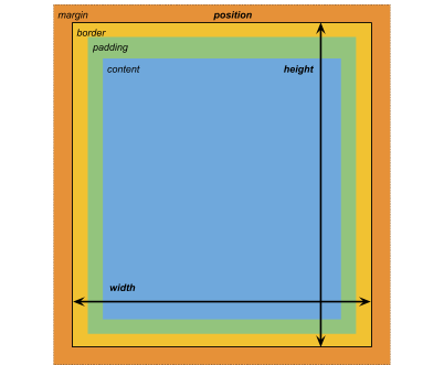
Box model

Dimensions
- width: <number>
- height: <number>
- min-width: <number>
- min-height: <number>
- max-width: <number>
- max-height: <number>
The width and height specifies the size of the element in pixelsThe smallest unit in a computer image. Pixel size depends on your screen resolution. Pixel lighting is calculated at every screen pixel. More info
See in Glossary. If width is not specified, the width is based on the width of the element’s contents. If height is not specified, the height is based on the height of the element’s contents.
Margins
- margin-left: <number>
- margin-top: <number>
- margin-right: <number>
- margin-bottom: <number>
Borders
- border-left-width: <number>
- border-top-width: <number>
- border-right-width: <number>
- border-bottom-width: <number>
Padding
- padding-left: <number>
- padding-top: <number>
- padding-right: <number>
- padding-bottom: <number>
Flex layout
This section lists the properties for positioning visual elements. UIElements includes a layout engine that positions visual elements based on layout and styling properties. The layout engine implements a subset of Flexbox: a HTML/CSS layout system.
By default, all items are vertically placed in their container.
Items
- flex-grow: <number>
- flex-shrink: <number>
- flex-basis: <number> | auto
- flex: none | [ <flex-grow> [ <flex-shrink> <flex-basis>? ]? ]
- align-self: auto | flex-start | flex-end | center | baseline | stretch
Note: Because units are not supported, the <flex-basis> value must always be specified last.
Containers
- flex-direction: row | row-reverse | column | column-reverse
- flex-wrap: nowrap | wrap | wrap-reverse
- align-content: flex-start | flex-end | center | space-between | space-around | stretch
- align-items: flex-start | flex-end | center | baseline | stretch
- justify-content: flex-start | flex-end | center | space-between | space-around | space-evenly
Relative and absolute positioning
Positioning
- position: absolute | relative
This property is set to relative by default, which positions the element based on its parent. If this property is set to absolute, the element leaves its parent layout and values are specified based on the parent bounds.
Position
- left
- top
- right
- bottom
The distance in pixels from the parent edge or the original position of the element.
Drawing properties
The drawing properties set the background, borders, and appearance of the visual element.
Background
- background-color: <color>
- background-image: <resource> | <url> | none
- -unity-background-scale-mode: stretch-to-fill | scale-and-crop | scale-to-fit
Borders
- border-color: <color>
- border-left-radius: <number>
- border-top-radius: <number>
- border-right-radius: <number>
- border-bottom-radius: <number>
Appearance
- overflow: hidden | visible
- opacity: <number>
- visibility: visible | hidden
Text properties
Text properties set the color, font, font size, and Unity specific properties for font resource, font style, alignment, word wrap, and clipping.
- color: <color>
- -unity-font: <resource> | <url>
- font-size: <number>
- -unity-font-style: normal | italic | bold | bold-and-italic
- -unity-text-align: upper-left | middle-left | lower-left | upper-left | middle-center | lower-center | upper-right | middle-right | lower-right
- -unity-word-wrap: true | false
- -unity-clipping: clip | overflow
Cursor property
Use the cursor default texture type to import a custom texture for the cursor. The Unity editor only supports default cursor values.
cursor: [ [ <resource> | <url> ][ <hotspotX> <hotspotY>]? , ][ arrow | text | resize-vertical | resize-horizontal | link | slide-arrow | resize-up-right | resize-up-left | move-arrow | rotate-arrow | scale-arrow | arrow-plus | arrow-minus | pan | orbit | zoom | fps | split-resize-up-down | split-resize-left-right ]
Obsolete and renamed properties
This section lists the drawing properties that were either made obsolete or renamed in UIElements. The obsolete and renamed properties are listed alphabetically.
-
background-sizehas been renamed-unity-background-scale-mode. -
border-left,border-top,border-right, andborder-bottomhave been renamedborder-left-width,border-top-width,border-right-width, andborder-bottom-width, respectively. -
fonthas been renamed-unity-font. -
font-stylehas been renamed-unity-font-style. -
position-left,position-top,position-right, andposition-bottomhave been renamedleft,top,right, andbottom, respectively. -
position-typehas been renamedposition. -
text-alignmenthas been renamed-unity-text-align. -
text-clippinghas been renamed-unity-clipping. It is recommended that you use the standardoverflowproperty instead. -
text-colorhas been renamedcolor. -
-word-wraphas been renamed-unity-word-wrap.
- 2018–11–16 Page amended with limited editorial review