Button
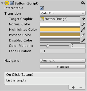
The Button control responds to a click from the user and is used to initiate or confirm an action. Familiar examples include the Submit and Cancel buttons used on web forms.


Properties
| Property: | Function: |
|---|---|
| Interactable | Will this component will accept input? See Interactable. |
| Transition | Properties that determine the way the control responds visually to user actions. See Transition Options. |
| Navigation | Properties that determine the sequence of controls. See Navigation Options. |
Events
| Property: | Function: |
|---|---|
| On Click | A UnityEvent that is invoked when when a user clicks the button and releases it. |
Details
The button is designed to initiate an action when the user clicks and releases it. If the mouse is moved off the button control before the click is released, the action does not take place.
The button has a single event called On Click that responds when the user completes a click. Typical use cases include:
- Confirming a decision (eg, starting gameplay or saving a game)
- Moving to a sub-menu in a GUI
- Cancelling an action in progress (eg, downloading a new scene)
Copyright © 2023 Unity Technologies
优美缔软件(上海)有限公司 版权所有
"Unity"、Unity 徽标及其他 Unity 商标是 Unity Technologies 或其附属机构在美国及其他地区的商标或注册商标。其他名称或品牌是其各自所有者的商标。
公安部备案号:
31010902002961