Extending IMGUI
There are a number of ways to leverage and extend the IMGUI system to meet your needs. Controls can be mixed and created, and you have a lot of leverage in dictating how user input into the GUI is processed.
Compound Controls
There might be situations in your GUI where two types of Controls always appear together. For example, maybe you are creating a Character Creation screen, with several Horizontal Sliders. All of those Sliders need a Label to identify them, so the player knows what they are adjusting. In this case, you could partner every call to GUI.Label() with a call to GUI.HorizontalSlider(), or you could create a Compound Control which includes both a Label and a Slider together.
/* Label and Slider Compound Control */


// JavaScript
var mySlider : float = 1.0;

function OnGUI () {
    mySlider = LabelSlider (Rect (10, 100, 100, 20), mySlider, 5.0, "Label text here");
}

function LabelSlider (screenRect : Rect, sliderValue : float, sliderMaxValue : float, labelText : String) : float {
    GUI.Label (screenRect, labelText);
    screenRect.x += screenRect.width; // <- Push the Slider to the end of the Label
    sliderValue = GUI.HorizontalSlider (screenRect, sliderValue, 0.0, sliderMaxValue);
    return sliderValue;
}


// C#
using UnityEngine;
using System.Collections;

public class GUITest : MonoBehaviour {

    private float mySlider = 1.0f;

    void OnGUI () {
        mySlider = LabelSlider (new Rect (10, 100, 100, 20), mySlider, 5.0f, "Label text here");
    }

    float LabelSlider (Rect screenRect, float sliderValue, float sliderMaxValue, string labelText) {
        GUI.Label (screenRect, labelText);

        // <- Push the Slider to the end of the Label
        screenRect.x += screenRect.width;

        sliderValue = GUI.HorizontalSlider (screenRect, sliderValue, 0.0f, sliderMaxValue);
        return sliderValue;
    }

}
In this example, calling LabelSlider() and passing the correct arguments will provide a Label paired with a Horizontal Slider. When writing Compound Controls, you have to remember to return the correct value at the end of the function to make it interactive.

Static Compound Controls
By using Static functions, you can create an entire collection of your own Compound Controls that are self-contained. This way, you do not have to declare your function in the same script you want to use it.
/* This script is called CompoundControls */


// JavaScript
static function LabelSlider (screenRect : Rect, sliderValue : float, sliderMaxValue : float, labelText : String) : float {
    GUI.Label (screenRect, labelText);
    screenRect.x += screenRect.width; // <- Push the Slider to the end of the Label
    sliderValue = GUI.HorizontalSlider (screenRect, sliderValue, 0.0, sliderMaxValue);
    return sliderValue;
}


// C#
using UnityEngine;
using System.Collections;

public class CompoundControls : MonoBehaviour {

    public static float LabelSlider (Rect screenRect, float sliderValue, float sliderMaxValue, string labelText) {
        GUI.Label (screenRect, labelText);

        // <- Push the Slider to the end of the Label
        screenRect.x += screenRect.width;

        sliderValue = GUI.HorizontalSlider (screenRect, sliderValue, 0.0f, sliderMaxValue);
        return sliderValue;
    }

}
By saving the above example in a script called CompoundControls, you can call the LabelSlider() function from any other script by simply typing CompoundControls.LabelSlider() and providing your arguments.
Elaborate Compound Controls
You can get very creative with Compound Controls. They can be arranged and grouped in any way you like. The following example creates a re-usable RGB Slider.
/* RGB Slider Compound Control */


// JavaScript
var myColor : Color;

function OnGUI () {
    myColor = RGBSlider (Rect (10,10,200,10), myColor);
}

function RGBSlider (screenRect : Rect, rgb : Color) : Color {
    rgb.r = GUI.HorizontalSlider (screenRect, rgb.r, 0.0, 1.0);
    screenRect.y += 20; // <- Move the next control down a bit to avoid overlapping
    rgb.g = GUI.HorizontalSlider (screenRect, rgb.g, 0.0, 1.0);
    screenRect.y += 20; // <- Move the next control down a bit to avoid overlapping
    rgb.b = GUI.HorizontalSlider (screenRect, rgb.b, 0.0, 1.0);
    return rgb;
}


// C#
using UnityEngine;
using System.Collections;

public class GUITest : MonoBehaviour {

    public Color myColor;

    void OnGUI () {
        myColor = RGBSlider (new Rect (10,10,200,10), myColor);
    }

    Color RGBSlider (Rect screenRect, Color rgb) {
        rgb.r = GUI.HorizontalSlider (screenRect, rgb.r, 0.0f, 1.0f);

        // <- Move the next control down a bit to avoid overlapping
        screenRect.y += 20;
        rgb.g = GUI.HorizontalSlider (screenRect, rgb.g, 0.0f, 1.0f);

        // <- Move the next control down a bit to avoid overlapping
        screenRect.y += 20;

        rgb.b = GUI.HorizontalSlider (screenRect, rgb.b, 0.0f, 1.0f);
        return rgb;
    }
}

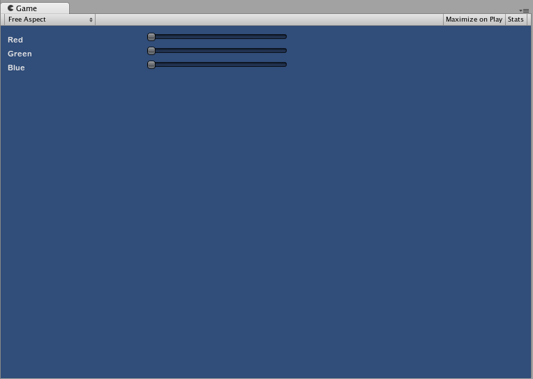
Now let’s build Compound Controls on top of each other, in order to demonstrate how Compound Controls can be used within other Compound Controls. To do this, we will create a new RGB Slider like the one above, but we will use the LabelSlider to do so. This way we’ll always have a Label telling us which slider corresponds to which color.
/* RGB Label Slider Compound Control */


// JavaScript
var myColor : Color;

function OnGUI () {
    myColor = RGBLabelSlider (Rect (10,10,200,20), myColor);
}

function RGBLabelSlider (screenRect : Rect, rgb : Color) : Color {
    rgb.r = CompoundControls.LabelSlider (screenRect, rgb.r, 1.0, "Red");
    screenRect.y += 20; // <- Move the next control down a bit to avoid overlapping
    rgb.g = CompoundControls.LabelSlider (screenRect, rgb.g, 1.0, "Green");
    screenRect.y += 20; // <- Move the next control down a bit to avoid overlapping
    rgb.b = CompoundControls.LabelSlider (screenRect, rgb.b, 1.0, "Blue");
    return rgb;
}


// C#
using UnityEngine;
using System.Collections;

public class GUITest : MonoBehaviour {

    public Color myColor;

    void OnGUI () {
        myColor = RGBSlider (new Rect (10,10,200,30), myColor);
    }

    Color RGBSlider (Rect screenRect, Color rgb) {
        rgb.r = CompoundControls.LabelSlider (screenRect, rgb.r, 1.0f, "Red");

        // <- Move the next control down a bit to avoid overlapping
        screenRect.y += 20;
        rgb.g = CompoundControls.LabelSlider (screenRect, rgb.g, 1.0f, "Green");

        // <- Move the next control down a bit to avoid overlapping
        screenRect.y += 20;

        rgb.b = CompoundControls.LabelSlider (screenRect, rgb.b, 1.0f, "Blue");

        return rgb;
    }

}
