Using App UI
Warning
FOR INTERNAL UNITY USE ONLY. THIS FRAMEWORK IS NOT SUPPORTED AND IS USED AT YOUR OWN RISK.
Once you have installed App UI Unity Package, you can start using it in your Unity projects.
App UI Unity Package consists mainly of a set of UI Toolkit components. If you are not familiar with UI Toolkit, we recommend you to read the UI Toolkit documentation and the overall Unity Documentation before using App UI.
App UI UI-Toolkit Themes
Note
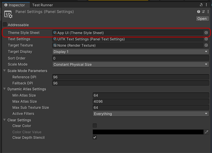
UI-Toolkit themes are files with the .tss extension which can be loaded in your PanelSettings component or selected in UI Builder via the theme dropdown in the viewport.
App UI comes with several UI-Toolkit themes that you can use in your projects. They are located in the PackageResources/Styles/Themes folder.
It is important to set a theme in your project.
For more information about themes, see the Theming documentation page.
Default Theme
App UI.tss: This is the main theme that encapsulates every contexts via different USS selectors. We recommend to use this theme if you are building a runtime app that needs to be able to switch between different color schemes, scales, layout directions, etc.
Themes for UI Builder
Theses themes are designed to be used with the UI Builder, they are the combination styling related contexts (color scheme and scale).
App UI - Dark - Large.tssApp UI - Dark - Medium.tssApp UI - Dark - Small.tssApp UI - Light - Large.tssApp UI - Light - Medium.tssApp UI - Light - Small.tssApp UI - Editor Dark - Large.tssApp UI - Editor Dark - Medium.tssApp UI - Editor Dark - Small.tssApp UI - Editor Light - Large.tssApp UI - Editor Light - Medium.tssApp UI - Editor Light - Small.tss
Root Panel Element
App UI components are designed to be used inside a Panel component.
The Panel component is a VisualElement that provides an initial context to the UIDocument which will be propagated to its children. Having a context is vital for App UI components to be displayed correctly, as they provide information such as the current theme (color scheme), the language, layout direction, etc.
In addition to the context, the Panel component also provides a layering system to handle popups, notifications, and tooltips (they will appear in the same UIDocument as overlays).
To know more about Context management, see the Context documentation page.
Here is how to use the Panel component in a UI Document:
<UXML xmlns="UnityEngine.UIElements" xmlns:appui="Unity.AppUI.UI">
    <appui:Panel>
        <!-- Your UI elements -->
    </appui:Panel>
</UXML>
App UI Components
App UI components are defined as VisualElement in UI Toolkit.
You can find them in the Unity.AppUI.UI namespace.
If you are working directly by editing UXML files, we recommend to define the appui namespace inside.
<UXML xmlns="UnityEngine.UIElements" xmlns:appui="Unity.AppUI.UI">
    [...]
</UXML>
You can also update the UXML Schema definition to get autocompletion in your IDE by selecting Assets > Update UXML Schema in the Editor.
Here is an example of usage inside a UI Document:
<UXML xmlns="UnityEngine.UIElements" xmlns:appui="Unity.AppUI.UI">
    <appui:Panel>
        <appui:Button title="Hello World!" />
    </appui:Panel>
</UXML>
