Transition from Unity UI (UGUI) to UI Toolkit
This page guides developers with experience in Unity UI (UGUI) to transition to the new UI Toolkit system. It explores the similarities and differences between UGUI and the UI Toolkit.
As UGUI is a runtime-only UI system, this page focuses on runtime UI. UI Toolkit can create both runtime and Editor UI. This guide applies to both use cases for UI Toolkit.
UIヒエラルキー
Both UGUI and UI Toolkit build and maintain the UI inside a hierarchy tree structure. In UGUI, all elements in this hierarchy are visible as individual GameObjects in the hierarchy view panel. In UI Toolkit, visual elements organize into a Visual Tree. The Visual Tree isn’t visible in the panel.
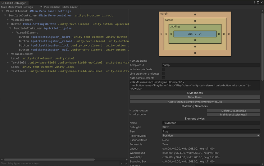
To view and debug the UI hierarchy in UI Toolkit, you can use the UI Debugger. You can find UI Debugger in the Editor toolbar, under Window > UI Toolkit > Debugger.
Key differences
Canvas versus UIDocument
The Canvas component in UGUI is similar to the UIDocument component in UI Toolkit. Both are MonoBehaviours that attach to GameObjects.
In UGUI, a Canvas component sits at the root of the UI tree. It works with the Canvas Scaler component to determine the sort order, rendering, and scaling mode of the UI underneath.
In UI Toolkit, the UIDocument component contains a reference to a PanelSettings object. The PanelSettings contains the rendering settings for the UI, including the scale mode and the sort order. Multiple UIDocument components can point to the same PanelSettings object, which optimizes performance when using multiple UI screens in the same scene.
In UGUI, the UI tree hierarchy sits underneath the GameObject holding the Canvas component. In UI Toolkit, the UIDocument component holds a reference to the root element of the Visual Tree.
The UIDocument component also contains a reference to the UXML file that defines the UI layout from which the Visual Tree is built at runtime. See Creating UI section for more information.
| ノート: |
|---|
For Editor UI, no UIDocument component is needed. You can derive your custom class from EditorWindow, then implement CreateGUI(). For a practical example, see the guide on Creating custom Editor windows. |
GameObject Components versus Visual Elements
UI Toolkit refers to UI elements as controls or visual elements. Examples of UI elements are:
- Controls
- ボタン
- Text labels
UGUI builds the UI hierarchy from GameObjects. Adding new UI elements requires adding new GameObjects to the hierarchy. The individual controls are implemented as MonoBehaviour components.
In UI Toolkit, the Visual Tree is virtual and doesn’t use GameObjects. You can no longer build or view the UI hierarchy in the hierarchy view, but it removes the overhead of using a GameObject for each UI element.
In UGUI, UI elements derive (directly or indirectly) from the UIBehavior base class. Similarly, in UI Toolkit all UI elements derive from a base class called VisualElement. The key difference is the VisualElement class doesn’t derive from MonoBehaviour. You can not attach visual elements to GameObjects.
Working with UI Toolkit controls in script is similar to working with UGUI controls. The following table shows common script interactions with UI controls in UGUI, and their UI Toolkit counterparts.
| アクション | UGUI | UI Toolkit |
|---|---|---|
| ラベルにテキストを書き込む | m_Label.text = "My Text"; |
m_Label.text = "My Text"; |
| トグルの状態を読み取る | bool isToggleChecked = m_Toggle.isOn; |
bool isToggleChecked = m_Toggle.value; |
| ボタンへのコールバックの割り当て | m_Button.onClick.AddListener(MyCallbackFunc); |
m_Button.clicked += MyCallbackFunc_1;or m_Button.RegisterCallback<ClickEvent>(MyCallbackFunc_2);
|
コントロールとそのプロパティやイベントについての詳細は、 Controls Overview ページをご覧ください。
UI要素へのアクセス
In UGUI, there are two ways scripts can access UI elements:
- Assigning a reference to the UI components in the Editor.
- Finding the components in the hierarchy using helper functions such as
GetComponentInChildren<T>().
Since there are no GameObject or components in UI Toolkit, you can’t directly assign references to a control in the Editor. They must be resolved at runtime using a query function.
Instead, access the Visual Tree via the UIDocument component.
UIDocument is a MonoBehaviour, so you can assign it as a reference and make it part of a Prefab. The UIDocument component holds a reference to the root visual element. From the root, scripts can find child elements by type or by name, similar to UGUI.
The table below shows a direct comparison of accessing UI controls in Unity UI and UI Toolkit
| アクション | UGUI | UI Toolkit |
|---|---|---|
| UI要素を名前で探す | transform.FindChild("childName"); |
rootVisualElement.Query("childName"); |
| UI要素のタイプ別検索 | transform.GetComponentInChildren<Button>(); |
rootVisualElement.Query<Button>(); |
| エディターでの参照の直接割り当て | Possible | Not possible |
UIの作成
One of the biggest differences between UGUI and UI Toolkit is the creation of user interfaces.
Both UGUI and UI Toolkit allow you to visually build the UI and preview it in the Editor. In UGUI, the UI is then saved inside a Prefab, along with any logic scripts attached to individual UI controls.
In UI Toolkit, The UI layout is created in UI Builder, then saved as one or multiple UXML files. At runtime, UIDocument components load the UXML files that the Visual Tree assembles in memory.
For a method similar to UGUI, you can create UI controls directly from a script, then add them to a Visual Tree at runtime.
プレハブ
UGUI uses GameObjects for individual UI controls and Prefabs that both contain visuals and logic. UI Toolkit takes a different approach to reusability, as it separates logic and layout. You can create reusable UI components through UXML and custom controls.
To create a similar template to a Prefab in UI Toolkit:
- Create a UXML file for the partial UI element.
- Create a GameObject with a
UIDocumentcomponent. - Reference the UXML file in the GameObject.
- Add a script to handle the UI component logic to the same GameObject.
- Save the GameObject as a Prefab.
UI Layout
Arranging individual UI elements on screen in UGUI is a manual process. By default, UI controls are free floating and are only affected by their direct parent. Other UI controls under the same parent don’t affect their siblings positions or sizes. Pivots and anchors control the position and size of an element.
The UI Toolkit layout system is influenced by web design, and based on automatic layout generation. The automatic layout system affects all elements by default, and an element’s size and position will affect other elements under the same parent.
The default behavior in UI Toolkit is comparable to placing all elements inside a VerticalLayoutGroup in UGUI, and adding a LayoutElement component to each.
You can disable automatic layout generation by changing the IStyle position property of the visual element. All visual elements have this property. See Visual Tree for a code sample.
UI Toolkit has no direct equivalents for anchoring and pivots of UI elements, due to the fundamental layout differences compared to UGUI.
The size and position of an element is controlled by the layout engine. To learn more about this, please see the Layout Engine documentation, and the Positioning section of the Visual Tree page.
レンダリングの順番
In UGUI, the order of the GameObjects in the hierarchy determines the rendering order. Objects further down in the hierarchy render last and appear on top. In a scene with multiple Canvases, the Sort Order on the root Canvas component determines the render order of the individual UI trees.
The render order in a Visual Tree in UI Toolkit operates the same way. Parent elements render before their children, and children render from the first to the last, so that the last appears on top. IUn a scene with multiple UI Documents, the render order is determined by the Sort Order setting on the root UIDocument component.
To change the rendering order of an element in UGUI, such as making an element appear on top, you can call the sibling functions on the Transform component of the GameObject. The VisualElement class offers comparable functions to control the rendering order. As all UI Toolkit controls derive from this class, all controls have access to this function.
The table below shows the UGUI functions to control render order and the equivalent functions in UI Toolkit:
| アクション | UGUI | UI Toolkit |
|---|---|---|
| 要素を他の兄弟の下にレンダリングする | transform.SetAsFirstSibling(); |
myVisualElement.SendToBack(); |
| 要素を他の兄弟の上にレンダリングする | transform.SetAsLastSibling(); |
myVisualElement.BringToFront(); |
| 要素の兄弟に対するレンダリング順序を手動で制御する | transform.SetSiblingIndex(newIndex); |
myVisualElement.PlaceBehind(sibling);myVisualElement.PlaceInFront(sibling);
|
イベント
Just like in UGUI, user interactions in UI Toolkit trigger events. The code can subscribe to receive a callback on events, such as pressing a button or moving a slider.
In UGUI, all UI elements are based on MonoBehaviour, and can expose their events in the Editor. This allows to set up logic with other GameObjects, for example to hide or unhide other UI elements, or to assign callback functions.

In UI Toolkit, logic and UI layout are stored separately. Callbacks can no longer be set up directly on GameObjects or stored in Prefabs. You must set up all callbacks at runtime, and handle them via scripting.
Button playButton = new Button("Play");
playButton.RegisterCallback<ClickEvent>(OnPlayButtonPressed);
...
private void OnPlayButtonPressed(ClickEvent evt)
{
  // Handle button press
}
The event dispatching system in UI Toolkit differs from events in UGUI. Depending on the event type, events aren’t just sent to the target UI control, but also to all the parent controls.
To learn more about this, see Events Dispatching.
Copyright © 2023 Unity Technologies
优美缔软件(上海)有限公司 版权所有
"Unity"、Unity 徽标及其他 Unity 商标是 Unity Technologies 或其附属机构在美国及其他地区的商标或注册商标。其他名称或品牌是其各自所有者的商标。
公安部备案号:
31010902002961