Controls
A control is an element of a graphical user interface, such as a button, label or checkbox. It includes the visuals of the control, and the scripted logic to operate and interact with the control.
In UI(User Interface) Allows a user to interact with your application. Unity currently supports three UI systems. More info
See in Glossary Toolkit, a control combines a visual elementsA node of a visual tree that instantiates or derives from the C# VisualElement class. You can style the look, define the behaviour, and display it on screen as part of the UI. More info
See in Glossary with scripting into a template that you can use inside a UI panel.
Controls can consist of a single visual element, or a combination of multiple visual elements.
For example, the Toggle control as shown below, contains three elements:
- A text label
- An image of a box
- An image of a checkmark
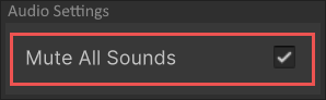
The implementation of the Toggle control defines the behavior of the control. It has an internal value of whether the toggle state is true or false. This logic alternates the visibility of the checkmark image when the value changes.
Add controls to a UI
To use a control in a UI, add it to the Visual TreeAn object graph, made of lightweight nodes, that holds all the elements in a window or panel. It defines every UI you build with the UI Toolkit.
See in Glossary. You can add the control through a C# script, UXML, or in the UI Builder.
The following C# code example adds a Button control to an existing visual tree.
var newButton = new Button("Click me!");
rootVisualElement.Add(newButton);
When adding controls to a UI hierarchy, the layout engine automatically handles the sizing and positioning. You can also override the size and position of visual elements.
You can define the look of visual elements with one of the following methods:
- Create a USS file.
- Define the look directly in UI Builder.
- Modify the style property of the element in a C# script.
Interact with controls
Controls are interactive and represent a value that you can change. For example, a FloatField represents a float value. You can create C# scriptsA piece of code that allows you to create your own Components, trigger game events, modify Component properties over time and respond to user input in any way you like. More info
See in Glossary to change the value of a control, register a callback, or apply data binding.
Change the control value
To access or change the value of a control, use its value property.
The following C# example creates a Toggle control and a Button control. When you click the button, the value of the toggle flips.
// Create a toggle and register callback
m_MyToggle = new Toggle("Test Toggle") { name = "My Toggle" };
rootVisualElement.Add(m_MyToggle);

// Create button to flip the toggle's value
Button button01 = new Button() { text = "Toggle" };
button01.clicked += () =>
{
    m_MyToggle.value = !m_MyToggle.value;
};
rootVisualElement.Add(button01);
For more information about the properties of a specific control, see the UI Toolkit controls reference.
Register a callback
Controls that have value properties send an event if the value changes. You can register a callback to receive this event.
The following code example creates a Toggle control and registers a callback:
// Create a toggle and register callback
m_MyToggle = new Toggle("Test Toggle") { name = "My Toggle" };
m_MyToggle.RegisterValueChangedCallback((evt) => { Debug.Log("Change Event received"); });
rootVisualElement.Add(m_MyToggle);
To learn more about callbacks and events, see Events Handling.
Apply data binding
You can bind controls to an object or a serialized property. For example, you can bind a FloatField control to a public float variable that belongs to a MonoBehaviour. When the control binds to the property, it automatically displays the value of the property. When you modify the control, the value of the property updates.
Similarly, when the property value changes via code, the UI displays the updated value. This two-way connection is useful when creating custom InspectorA Unity window that displays information about the currently selected GameObject, asset or project settings, allowing you to inspect and edit the values. More info
See in Glossary windows.
See Binding for information on data binding.
Not all controls are bindable. For a list of built-in controls and whether they support binding, see UI Toolkit controls reference.
Built-in and custom controls
Unity includes a large range of standard controls, such as labels, text fields, and toggles.
You can also create custom controls, and implement custom logic for user interface elements. For more information, see Custom controls.
Copyright © 2023 Unity Technologies
优美缔软件(上海)有限公司 版权所有
"Unity"、Unity 徽标及其他 Unity 商标是 Unity Technologies 或其附属机构在美国及其他地区的商标或注册商标。其他名称或品牌是其各自所有者的商标。
公安部备案号:
31010902002961