Create a custom control
To create a custom control, you must create a custom control C# class and initialize it. You can expose it for use in UXML and UI(User Interface) Allows a user to interact with your application. Unity currently supports three UI systems. More info
See in Glossary Builder. You can also bind it to data.
Create a custom control class
Create a C# class derived from the VisualElement class or a subclass of the VisualElement class. For example, you can create a bindable custom control derived from the BaseField generic base class instead of BindableElement. This provides the following advantages:
- Implements the
INotifyValueChangedinterface for the generic parameter type that you specify - Makes the control focusable by default
- Provides a horizontal layout with a label element on the left and input on the right
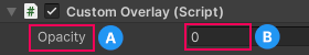
BaseField.A. The label element.
B. The input element.
Note: It’s possible to create custom controls derived from built-in UI controls, if you understand their internal hierarchy and existing USS classes. Unity discourages this practice because your custom controls might be dependent on their internal structure, which is subject to change in the future.
Initialize a custom control
Custom controls inherit from VisualElement. A VisualElement isn’t bound to the lifetime of a GameObjectThe fundamental object in Unity scenes, which can represent characters, props, scenery, cameras, waypoints, and more. A GameObject’s functionality is defined by the Components attached to it. More info
See in Glossary and doesn’t receive any of these callbacks:
Awake()OnEnable()OnDisable()OnDestroy()
You can initialize a custom control in its constructor. However, if your application needs, you can delay initialization until the custom control is added to the UI. To do this, register a callback for an AttachToPanelEvent. To detect that your custom control has been removed from the UI, use the DetachFromPanelEvent callback.
public CustomControl()
{
    var myCustomElement = rootVisualElement.Q(className: "my-custom-element");
    myCustomElement.RegisterCallback<AttachToPanelEvent>(e =>
        { /* do something here when element is added to UI */ });
    myCustomElement.RegisterCallback<DetachFromPanelEvent>(e =>
        { /* do something here when element is removed from UI */ });
}
UI Toolkit dispatches these two events for all elements and doesn’t need a custom VisualElement subclass. For more information, see Panel events.
Expose custom controls to UXML and UI Builder
To use your custom controls with UXML and UI Builder, you must expose them. To expose custom controls, define a factory class derived from UxmlFactory<T>.
You can add new attributes to a custom control to use in UXML. To add new attributes to a custom control, define a traits class derived from UxmlTraits and override the Init() method as described in Define attributes on elements. The UI Builder relies on this to ensure that the visual elementA node of a visual tree that instantiates or derives from the C# VisualElement class. You can style the look, define the behaviour, and display it on screen as part of the UI. More info
See in Glossary created for the ViewportThe user’s visible area of an app on their screen.
See in Glossary updates when you change the value of a UXML property in the InspectorA Unity window that displays information about the currently selected GameObject, asset or project settings, allowing you to inspect and edit the values. More info
See in Glossary.
To use your custom controls’ UXML properties in the Inspector of the UI Builder, you must match property names between UXML and C# script. Use standard kebab case notation for UXML, and camel case or Pascal case for C#. For example, a property named MyFloat or myFloat in C# should be my-float in UXML.
Bind custom controls to data
You bind custom controls to serialized properties to synchronize values between the control and the property.
To bind custom controls to data:
- Implement the
INotifyValueChangedinterface and listen forChangeEvents as needed. - Inherit from the
BindableElementclass or implement theIBindableinterface.
See SerializedObject data binding for more details.
For a bindable custom control example, see Create a bindable custom control.
Style custom controls with USS
Use USS to customize the look of a custom control the same way as a built-in control. You can also create USS custom properties to style a custom control.
Note: The Inspector window in the UI Builder doesn’t show USS custom properties. To edit USS custom properties, use a text editor to edit your USS file directly.
To interact with custom USS properties for a custom control in C#, use the CustomStyleProperty structure and the CustomStylesResolvedEvent event.
CustomStyleProperty describes the name and type of the property you read from the stylesheet.
UI Toolkit dispatches CustomStylesResolvedEvent for any element that directly receives a custom USS property. It dispatches the event for any element that a selector matches, for selectors for which the rule contains the value of the custom property. UI Toolkit doesn’t dispatch the event for elements that inherit the value. The event holds a reference to an ICustomStyle object. You must use its TryGetValue() method to read the effective value of a CustomStyleProperty. This method has overloads for different types of CustomStyleProperty.
For a custom style with a custom control example, see Create custom style for a custom control.
Note: You can’t define transitions for custom style properties.
Handle event for custom controls
For detailed information on how to handle events for custom controls, see Handle events.
Note:
- Unity dispatches keyboard events to the currently focused element. To handle keyboard events for a custom control, set properties related to
focus. - To handle touch and mouse input events, register callbacks for the relevant event types, such as pointer events and mouse events, in the constructor.
Use custom controls in UI Builder
To add a custom control to a visual treeAn object graph, made of lightweight nodes, that holds all the elements in a window or panel. It defines every UI you build with the UI Toolkit.
See in Glossary in UI Builder:
- Select Library > Project > Custom Controls (C#).
- Drag the custom control into the Hierarchy window.
Best practices and tips
Best practices:
- Expose properties that a custom control represents and other functional aspects of its behavior as UXML properties, and expose properties that affect the look of a custom control as USS properties.
- Use a namespace that’s unique, short, and readable to avoid name collisionsA collision occurs when the physics engine detects that the colliders of two GameObjects make contact or overlap, when at least one has a Rigidbody component and is in motion. More info
See in Glossary with other elements. - Keep UXML attributes primitive. Data that you can specify in UXML is limited to the set of primitive data types. UXML doesn’t support complex data structures or collections. Pass complex data to your custom controls at runtime via C# scriptsA piece of code that allows you to create your own Components, trigger game events, modify Component properties over time and respond to user input in any way you like. More info
See in Glossary or data binding, not in UXML. - In C#, expose USS classes or names as constants. This allows you to locate elements by class or name using UQuery.
- Adopt the BEM standard for USS classes. This allows you to address every element with a class list selector.
- Use static callbacks for a lower memory footprint. When you register an instance method to be used as a callback, you might create unnecessary allocations. To avoid allocations, use anonymous static lambda functions that call into regular C# static methods. You can retrieve the context of the current element through the
EventBase.currentTargetproperty.
Tips:
Render custom geometry through the
generateVisualContentcallback for custom controls. For an example usage that renders a partially filled circle, see RadialProgress example.-
Custom controls are convenient. However, you might achieve the same outcomes with the following:
- Assemble your UI from existing elements, and change their styles and properties.
- Use UXML templates. Use regular C#
MonoBehaviours to add logic that pertains to the specific UI Document that holds your UI. (To learn how to useMonoBehaviours to control UI in a UI Document, see Create your first runtime UI.) To achieve encapsulation, create properties and methods inside yourMonoBehaviourthat internally fetchVisualElements with UQuery and manipulate their properties.
Additional resources
Copyright © 2023 Unity Technologies
优美缔软件(上海)有限公司 版权所有
"Unity"、Unity 徽标及其他 Unity 商标是 Unity Technologies 或其附属机构在美国及其他地区的商标或注册商标。其他名称或品牌是其各自所有者的商标。
公安部备案号:
31010902002961