USS 支持的属性
本主题列出了支持的 USS 属性及其接受的值。
USS 数据类型
USS 数据类型定义 USS 属性接受的值和关键字。
- <length>: Represents a distance value.
- <number>: Represents either an integer or a number with a fractional component.
- <integer>: Represents a whole number.
- <color>: Represents a color. A color can be defined with a
#hexadecimalcode,rgb(), orrgba(). Color keywords such asblueortransparentare not supported. - <resource>: Represents an asset in a Resources folder.
- <url>: Represents an asset specified by a path. It can be expressed as either a relative path or an absolute path.
USS 语法
UIElements 样式属性使用与 W3C CSS 文档相同的语法句法:
- 关键字值按原样显示。例如:
auto、baseline。 - 基本数据类型出现在尖括号(
<和>)之间。例如:<length>、<color>。 - Non-terminals that share the same name as a property appear between angle brackets and single straight quotes (
<'and'>). For example, <‘width’>.
如果属性值包含多个组件:
- 几个词并列意味着它们全部必须以给定的顺序出现。
- A bar (
|) separates two or more alternatives: exactly one must occur. - A double bar (
||) separates two or more options: one or more must occur, in any order. - 双 & 符号 (
&&) 分隔两个或多个组件:全部都必须出现,顺序任意。 - 方括号 (
[]) 表示分组。
每个类型、关键字或尖括号组的后面都可以跟修饰符:
- 星号 (
*) 表示前面的类型、词或组出现零次或多次。 - 加号 (
+) 表示前面的类型、词或组出现一次或多次。 - 问号 (
?) 表示前面的类型、词或组是可选的。 - 花括号中的一对数字 (
{A,B}) 表示前面的类型、词或组出现至少A次且最多B次。
继承的属性
如果没有为继承的属性指定任何值,该元素将从其父元素获取值。例如,使用继承的属性来设置所有元素的字体。
:root {
    -unity-font: resource("Font/consola.ttf");
}
继承的属性如下:
- color
- font-size
- -unity-font
- -unity-font-style
- -unity-text-align
- visibility
- whitespace
框形模型
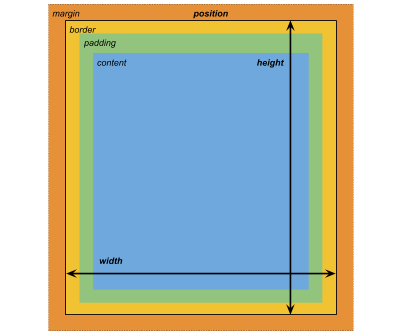
尺寸
- width: <length> | auto
- height: <length> | auto
- min-width: <length> | auto
- min-height: <length> | auto
- max-width: <length> | none
- max-height: <length> | none
width 和 height 指定元素的大小。如果未指定 width,则宽度基于元素内容的宽度。如果未指定 height,则高度基于元素内容的高度。
边距
- margin-left: <length> | auto;
- margin-top: <length> | auto
- margin-right: <length> | auto
- margin-bottom: <length> | auto
简便写法
- margin: [<length> | auto]{1,4}
margin 简便选项的应用方式如下:
- 1 length: Applied to all 4 margins.
- 2 lengths: The first is applied to
margin-topandmargin-bottom. The second is applied tomargin-leftandmargin-right. - 3 lengths: The first is applied to
margin-top. The second is applied tomargin-leftandmargin-right. The third is applied tomargin-bottom. - 4 lengths: The lengths are applied in this order :
margin-top,margin-right,margin-bottom,margin-left
边框
- border-left-width: <length>
- border-top-width: <length>
- border-right-width: <length>
- border-bottom-width: <length>
简便写法
- border-width: <length>{1,4}
border-width 简便选项的应用方式如下:
- 1 length: Applied to all 4 border widths.
- 2 lengths: The first is applied to
border-top-widthandborder-bottom-width. The second is applied toborder-left-widthandborder-right-width. - 3 lengths: The first is applied to
border-top-width. The second is applied toborder-left-widthandborder-right-width. The third is applied toborder-bottom-width. - 4 lengths: The lengths are applied in this order:
border-top-width,border-right-width,border-bottom-width,border-left-width
填充
- padding-left: <length>
- padding-top: <length>
- padding-right: <length>
- padding-bottom: <length>
简便写法
- padding: <length>{1,4}
padding 简便选项的应用方式如下:
- 1 length: Applied to all 4 padding.
- 2 lengths: The first is applied to
padding-topandpadding-bottom. The second is applied topadding-leftandpadding-right. - 3 lengths: The first is applied to
padding-top. The second is applied topadding-leftandpadding-right. The third is applied topadding-bottom. - 4 lengths: The lengths are applied in this order:
padding-top,padding-right,padding-bottom,padding-left
灵活布局
本节列出了用于定位视觉元素的属性。UIElements 包括一个布局引擎,可根据布局和样式属性定位视觉元素。该布局引擎实现了名为 Flexbox 的 HTML/CSS 布局系统的子集。
默认情况下,所有项都垂直放置在其容器中。
项
- flex-grow: <number>
- flex-shrink: <number>
- flex-basis: <length> | auto
- flex: none | [ <‘flex-grow’> <‘flex-shrink’>? || <‘flex-basis’> ]
- align-self: auto | flex-start | flex-end | center | stretch
容器
- flex-direction: row | row-reverse | column | column-reverse
- flex-wrap: nowrap | wrap | wrap-reverse
- align-content: flex-start | flex-end | center | stretch
- align-items: flex-start | flex-end | center | stretch
- justify-content: flex-start | flex-end | center | space-between | space-around
相对和绝对位置
定位
- position: absolute | relative
默认情况下,此属性设置为 relative:根据父级来定位元素。如果此属性设置为 absolute,则元素将保留其父级布局,并根据父级边界指定值。
位置
- left: <length> | auto
- top: <length> | auto
- right: <length> | auto
- bottom: <length> | auto
相对于元素父级边缘或原始位置的距离。
绘制属性
绘制属性用于设置视觉元素的背景、边框和外观。
背景
- background-color: <color>
- background-image: <resource> | <url> | none
- -unity-background-scale-mode: stretch-to-fill | scale-and-crop | scale-to-fit
- -unity-background-image-tint-color: <color>
切片
分配背景图像时,可以根据简化的九宫格规范来绘制该图像:
- -unity-slice-left: <integer>
- -unity-slice-top: <integer>
- -unity-slice-right: <integer>
- -unity-slice-bottom: <integer>
边框
- border-color: <color>
- border-top-left-radius: <length>
- border-top-right-radius: <length>
- border-bottom-left-radius: <length>
- border-bottom-right-radius: <length>
简便写法
- border-radius: <length>{1,4}
border-radius 简便选项的应用方式如下:
- 1 length: Applied to all 4 border-radius properties.
- 2 lengths: The first is applied to
border-top-left-radiusandborder-bottom-right-radius. The second is applied toborder-bottom-left-radiusandborder-top-right-radius - 3 lengths: The first is applied to
border-top-left-radius. The second is applied toborder-bottom-left-radiusandborder-top-right-radius. The third is applied toborder-bottom-right-radius. - 4 lengths: The lengths are applied in this order:
border-top-left-radius,border-top-right-radius,border-bottom-right-radius,border-bottom-left-radius
外观
- overflow: hidden | visible
- opacity: <number>
- visibility: visible | hidden
- display: flex | none
The display default value is flex. Setting display to none removes the element.
文本属性
文本属性用于设置颜色、字体、字体大小以及 Unity 特有属性(字体资源、字形、对齐、自动换行和剪切)。
- color: <color>
- -unity-font: <resource> | <url>
- font-size: <number>
- -unity-font-style: normal | italic | bold | bold-and-italic
- -unity-text-align: upper-left | middle-left | lower-left | upper-center | middle-center | lower-center | upper-right | middle-right | lower-right
- white-space: normal | nowrap
光标属性
使用 cursor 默认纹理类型可为光标导入自定义纹理。
cursor: [ [ <resource> | <url> ][ <integer> <integer>]? , ][ arrow | text | resize-vertical | resize-horizontal | link | slide-arrow | resize-up-right | resize-up-left | move-arrow | rotate-arrow | scale-arrow | arrow-plus | arrow-minus | pan | orbit | zoom | fps | split-resize-up-down | split-resize-left-right ]
- 2018–11–16 页面已修订
Copyright © 2023 Unity Technologies
优美缔软件(上海)有限公司 版权所有
"Unity"、Unity 徽标及其他 Unity 商标是 Unity Technologies 或其附属机构在美国及其他地区的商标或注册商标。其他名称或品牌是其各自所有者的商标。
公安部备案号:
31010902002961