- Unity User Manual 2021.2
- 创建用户界面 (UI)
- UI 工具包
- UI 工具包入门
- Creating your first runtime UI
Creating your first runtime UI
This page will guide you through the steps to set up a simple character selection screen using UI Toolkit. It covers the creation of the UI elements and templates, the scene setup, and how to connect scripting logic to the UI. This guide won’t cover styling through USS, and use only default styles and theming.
您可以在本页底部此处找到本指南的最终源代码。
Topics covered: UI Builder, ListView, Label, PanelSettings, UIDocument, selection handling

本指南将指导您完成以下步骤:
- Create the main UI view
- Setup the scene
- Create sample data to display
- Create a controller for the main view
- Create a list entry UI template
- Create a controller for a list entry
- React to user selection
Create the main UI view
The final UI screen is composed of two individual UI templates (UXML). The main view template contains the list with the character names, a smaller panel to display the selected character’s details, and a button. In this section you will set up this template using UI Builder.
| Note |
|---|
| If you are familiar with UI Builder and want to skip this step, you can copy the UXML code for the main view from the bottom of this page and paste it into a new file directly. Save it as Assets/UI/MainView.uxml. |

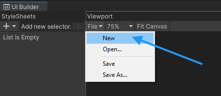
Open the UI Builder window via the menu Window > UI Toolkit > UI Builder. Create a new UXML document using the file menu at the top left of the viewport.
When developing game UI, always make sure to select the Unity Default Runtime Theme at the top right of the UI Builder’s viewport. Default font sizes and colors differ between Editor and Runtime themes and that affects your layout.

Select the new UXML file in the Hierarchy and enable the Match Game View checkbox. You might need to set your Unity Editor to a landscape resolution if you haven’t already.

Now it’s time to create UI elements! Create a new VisualElement by dragging it from the Library into the Hierarchy.

The new element needs to cover the entire screen, so you need to set the flex-grow property to 1. Select the element from the hierarchy and find the foldout labeled Flex in the Inspector panel on the right. Change the value for Grow from 0 to 1.

To center all children of this VisualElement in the middle of the screen, change the Align properties of the VisualElement. You need to set both Align Items and Justify Content to center.

Lastly, you can pick a background color under Background > Color. This step is optional. This example uses #732526 as the color.

Next, create a new VisualElement underneath the existing one. This will become the parent container for the left and right sections of the UI.

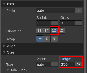
Set the flex-direction property to row for this new element (it defaults to column). You also need to set a fixed height of 350 pixels.
This is what the current UI should look like. Note that your screen might look different depending on the resolution and aspect ratio of your Game View.

To create the list for the character names, select a ListView control from the Library and add it as a child underneath the VisualElement you just created. Select the element and assign it the name CharacterList in the inspector. This is necessary so you can access this list via the controller script later.

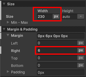
Set the list to have a fixed width of 230 pixels. Also give it a 6 px wide margin on the right, to crate some distance to the next elements that you are going to create.
You can also assign a background color and set a rounded border for the list. This guide uses #6E3925 for the background and #311A11 for the border color, with a 4px wide border and a 15px radius. This step is optional.

Add a new VisualElement under the same parent as the CharacterList. This will hold the character details panel and the button. Under the Align foldout, change the setting for Align Items to flex-end, and Justify Content to space-between.

Add a new VisualElement to this new container. This will become the character details panel. When the user selects a character from the list on the left, it will display the character’s portrait, name, and class.
Set a fixed width of 276 pixels for the element, and switch Align Items and Justify Content to center. Also add an 8 pixels wide padding for the element, so that the children will keep a minimum distance to the borders of the container.

You can style the panel by setting a background color of #AA5939 and a border color of #311A11 with a 4px wide border and a 15px radius. This step is optional.
Your UI layout should now look similar to the image below.

Next you’ll add the individual Ui controls to the character details. First is the character portrait. This consists of two elements - a frame in the background and an image in the foreground.
Add a new VisualElement to the character details container for the background frame first. Assign it a fixed size of 120x120 pixels, and a padding of 4 pixels so that the contained image won’t directly touch the border.
You can use a 2px-wide, 15px radius border with a color of #311A11 and a background color of #FF8554 to style the element. Feel free to apply your own colors and styling instead.

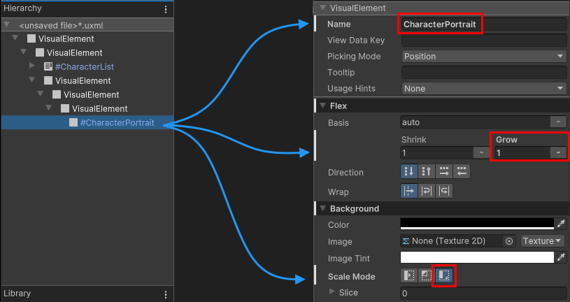
For the actual image add a new VisualElement as a child to the frame you just created. Name it CharacterPortrait so that you can access it in the controller script later.
Set Flex > Grow to 1, so that the image makes use of all the available space. Also make sure to change the scaling mode under Background > Scale Mode to scale-to-fit, so that the image can be scaled up or down to match the element size, while keeping the correct aspect ratio.
Next, add two label controls to the the character details container, which you will later use to display the selected character’s name and class. Name them CharacterName and CharacterClass.
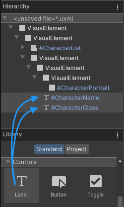
To make the character’s name stand out more than the class, change that label’s font size to 18, and set the style to bold.

Your UI screen should now look similar to the image below.

Lastly, add a Button control to the right side UI container. You will later access this button in the controller script and enable or disable it when a character is selected or deselected. Name the button SelectCharButton and give it a fixed width of 150px. You should also set the label text of the button to Select Character.
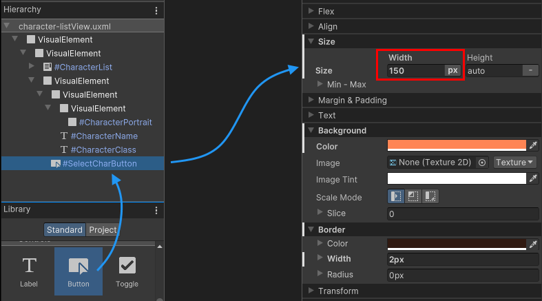
To style the button, set a background color of #FF8554, and a 2px border with a color of #311A11. This step is optional.
Your finished main view should look similar to the image below.

Save the UXML template as Assets/UI/MainView.uxml. You can also find the final UXML code for this template at the bottom of the page here.
Setup the scene
In this section you will learn how to load and display the UI template you created in the previous section in your game at runtime.
To start you need to create a PanelSettings asset. This asset will define the settings of your screen, such as scaling mode and rendering order. It will also determine the name under which your UI will appear in the UI Toolkit Debugger.

Create a new Panel Settings Asset by right-clicking in the project view. Choose Create > UI Toolkit > Panel Settings Asset. Name the newly created file GameUI_Panel.
For this guide you can leave all settings at their default values.

To display the main view UI template from the previous section you need to create a new GameObject in the scene. Attach a UIDocument component to it.
The UIDocument will automatically load the assigned VisualTreeAsset when entering Play mode in Unity. A VisualTreeAsset is a UXML template. Assign both the MainView.uxml and the new GameUI_Panel panel settings to the component.

| Note |
|---|
If you do not assign a PanelSettings asset to your UI Document component, it will automatically search the project and use the first Panel Settings Asset it finds automatically. Keep this in mind when renaming or moving assets. |
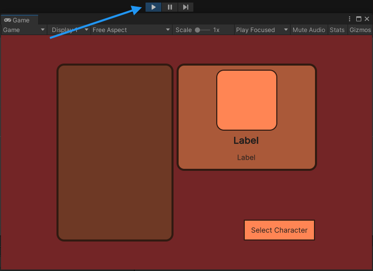
You can now enter Play mode in the Unity Editor and see your UI displayed in the game view.
| Note |
|---|
| If you have multiple UI Documents in your scene, you can assign the same panel settings asset to all. This will cause all UI to be rendered on the same panel, optimizing performance. |
Create sample data to display
In this section you will create some sample data that will be used to fill the character list in the UI with data.
For the character list you need a simple class that holds a character name, class, and a portrait image. Create a new ScriptableObject script Assets/Scripts/CharacterData.cs and paste the following code into the file:
using UnityEngine;

public enum ECharacterClass
{
  Knight, Ranger, Wizard
}

[CreateAssetMenu]
public class CharacterData : ScriptableObject
{
  public string m_CharacterName;
  public ECharacterClass m_Class;
  public Sprite m_PortraitImage;
}
The [CreateAssetMenu] attribute will automatically add an entry to the Create menu.
Right-click into a folder in the Project view to create instances of the new ScriptableObject.

Now you need to create a few CharacterData instances and fill them with random data. Place all of them in a folder Resources/Characters. You will write a script which automatically parses and loads all character data from this folder later.

Create a list entry UI template
In this section you will create a UI template for the individual entries in the list. At runtime, a controller script will create an instance of this UI for each character and add it to the list. The UI for a character list entry consists of acolored background frame and the character name.

| Note |
|---|
| If you want to skip this step, you can copy the UXML code for the list entry from the bottom of this page and paste it into a new file directly. Save it as Assets/UI/ListEntry.uxml. |
Open the UI Builder window via the menu Window > UI Toolkit > UI Builder. Create a new UXML template by selecting File > New.

Add a VisualElement for the background, and set a fixed heigth of 41px. Since the text inside the entry should be left aligned and placed in the middle of the element, open the Align foldout and set Align Items to left, and Justify Content to center. Also set a left padding of 10px, to make the label have a minimum distance to the left border of the frame.
For the styling, you can use #AA5939 for the background color and add a 2px wide border, with a 15px radius and a color of #311A11. This step is optional and you can apply your own colors and styling.

Add a label as a child to the existing VisualElement and name it CharacterName, so that you can access it later in the controller script. Set the Font Style to bold and the font size to 18.

Save the UXML template as Assets/UI/ListEntry.uxml. You can also find the final UXML code for this template at the bottom of the page here.
Create a controller for a list entry
In this section you will create a controller script for a list entry. The purpose of the script is to display the data of a character instance in the UI of the list entry. It needs to access the label for the character name and set it to display the name of the given character instance.
Create a new script Assets/Scripts/UI/CharacterListEntryController.cs and paste the following code into it:
using UnityEngine.UIElements;

public class CharacterListEntryController
{
  private Label m_NameLabel;

  public void SetVisualElement(VisualElement rootEleme)
  {
    m_NameLabel = visualElement.Q<Label>("CharacterName");
  }

  public void SetCharacterData(CharacterData characterData)
  {
    m_NameLabel.text = characterData.m_CharacterName;
  }
}
There are two functions in this class, and both of them are Set functions.
SetvisualElement(VisualElement visualElement)
This function will receive a visual element that is an instance of the ListEntry UI template you created in the previous section. The main view controller will create this instance. The purpose of this function is to retrieve a reference to the character name label inside the UI element.
SetCharacterData(CharacterData characterData)
This function receives the character whose name this list element is supposed to display. Because the elements list in a ListView are pooled and reused, it’s necessary to have a Set function to change which character’s data to display.
Note that the CharacterListEntry class is not a MonoBehaviour. Since the visual elements in UI Toolkit aren’t GameObjects, you can’t attach components to them. Instead, this class will be attached to the userData property in the next section.
Create a controller for the main view
In this section you will create a controller script for the character list in the main view, and a MonoBehaviour script that instantiates and assignes it to the visual tree.
To start, create a new script under Assets/Scripts/UI/CharacterListController.cs and paste the following code into it.
using System.Collections.Generic;
using UnityEngine;
using UnityEngine.UIElements;

public class CharacterListController
{
  public void InitializeCharacterList(VisualElement root, VisualTreeAsset listElementTemplate)
  {
  }
}
You’re going to fill in the InitializeCharacterList() method late on, but it’s important to add the empty method now, so that you can call it in the next section.
Attach the controller script to the main view
Just like the CharacterListEntryController, the CharacterListController is not a MonoBehaviour, and needs to be attached to the visual tree in a different manner.
You need to create a MonoBehaviour script that you can attach to the same GameObject as the UIDocument. It will instantiate the CharacterListController and attach it to the Visual Tree.
Create a new script Assets/Scripts/UI/MainView.cs and paste the following code into it:
using UnityEngine;
using UnityEngine.UIElements;

public class MainView : MonoBehaviour
{
  [SerializeField] private VisualTreeAsset m_ListEntryTemplate;

  void OnEnable()
  {
    // The UXML is already instantiated by the UIDocument component
    var uiDocument = GetComponent<UIDocument>();

    // Initialize the character list controller
    var characterListController = new CharacterListController();
    characterListController.InitializeCharacterList(uiDocument.rootVisualElement, m_ListEntryTemplate);
  }
}
Go into the Unity Editor and attach the script to the same GameObject that the UIDocument is on. Assign the ListEntry.uxml to the List Entry Template property.
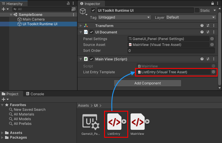
There’s no need for your script component to instantiate the MainView UXML, as this is done automatically in the UIDocument component on the same GameObject. The MainView script accesses the UIDocument component to get a reference of the already instantiated Visual Tree. It then creates an instance of the CharacterListController and passes in the root element of the visual tree and the UXML template used for the individual list elements.
| Note |
|---|
When the UI is reloaded, companion MonoBehaviour components on the same GameOBject containing the UIDocument component will be disabled prior to the reload, and then re-enabled after the reload. Therefore it’s a good practice to place code that interacts with the UI in the OnEnable and OnDisable methods of these MonoBehaviours. |
Enumerate all character data instances
The first functionality you should add to the controller script is a function that enumerates all the character data instances you created earlier. These will be used to fill the list.
Copy the code below into the CharacterListController class.
private List<CharacterData> m_AllCharacters;

private void EnumerateAllCharacters()
{
  m_AllCharacters = new List<CharacterData>();
  m_AllCharacters.AddRange(Resources.LoadAll<CharacterData>("Characters"));
}
| Note |
|---|
| This code assumes that you created the character instances in the Resources/Characters folder. You might need to adjust the folder name accordingly if you placed the characters in a different folder. |
Now you need to call the EnumerateAllCharacter method during initialization. Add a call to it to the top of the InitializeCharacterList method:
public void InitializeCharacterList(VisualElement root, VisualTreeAsset listElementTemplate)
{
  // Enumerate all characters
  EnumerateAllCharacters();
}
Get references to the UI elements
In this section you will fill in the content of the InitializeCharacterList method. The first thing this method needs to do is obtain references to all the individual UI controls it needs to access to display information. Use the UQuery family of APIs to retrieve individual UI controls by name, USS class, type, or a combination of these.
Extend the code inside the CharacterListController class with the code below:
// UXML template for list entries
private VisualTreeAsset m_ListEntryTemplate;

// UI element references
private ListView m_CharacterList;
private Label m_CharClassLabel;
private Label m_CharNameLabel;
private VisualElement m_CharPortrait;
private Button m_SelectCharButton;

public void InitializeCharacterList(VisualElement root, VisualTreeAsset listElementTemplate)
{
  // Enumerate all characters
  EnumerateAllCharacters();

  // Store a reference to the template for the list entries
  m_ListEntryTemplate = listElementTemplate;

  // Store a reference to the character list element
  m_CharacterList = root.Q<ListView>("CharacterList");

  // Store references to the selected character info elements
  m_CharClassLabel = root.Q<Label>("CharacterClass");
  m_CharNameLabel = root.Q<Label>("CharacterName");
  m_CharPortrait = root.Q<VisualElement>("CharacterPortrait");

  // Store a reference to the select button
  m_SelectCharButton = root.Q<Button>("SelectCharButton");
}
Fill the list with entries
Next you need to fill the list on the screen with the characters you enumerated and loaded earlier. To do so you need to create a new method FillCharacterList inside the CharacterListController class.
Filling a ListView with elements takes 4 steps:
- Create a
makeItemfunction - Create a
bindItemfunction - Set the item height
- Set the item source
The purpose of a makeItem callback function is to create a small visual tree representing the UI a single list item, and returning the root VisualElement of this tree.
In this case, the makeItem callback needs to instantiate the UXML template you created for the list entries. IT also needs to create an instance of the CharacterListEntryController controller script, which takes care of filling the UI with the data from the CharacterData.
Create a FillCharacterList method inside the class and paste the code below.
private void FillCharacterList()
{
  // Set up a make item function for a list entry
  m_CharacterList.makeItem = () =>
  {
    // Instantiate the UXML template for the entry
    var newListEntry = m_ListEntryTemplate.Instantiate();

    // Instantiate a controller for the data
    var newListEntryLogic = new CharacterListEntryController();

    // Assign the controller script to the visual element
    newListEntry.userData = newListEntryLogic;

    // Initialize the controller script
    newListEntryLogic.SetVisualElement(newListEntry);

    // Return the root of the instantiated visual tree
    return newListEntry;
  };
}
As part of the makeItem callback, you’re storing the controller script inside the userData property of the instantiated visual element. This allows you to access the script at a later time and assign different characters to the list element.
// Assign the controller script to the visual element
newListEntry.userData = newListEntryLogic;
As a memory and performance optimization, a ListView reuses list elements instead of instantiating one element for every entry in the list. It creates only enough visual elements to fill the visible area, and then pools and reuses them as the list is scrolled.
For this reason you need to provide a bindItem callback which binds an instance of your data (in this case CharacterData) to an individual list element.
Extend the FillCharacterList method by adding the code below at the bottom.
private void FillCharacterList()
{
  ...

  // Set up bind function for a specific list entry
  m_CharacterList.bindItem = (item, index) =>
  {
    (item.userData as CharacterListEntryController).SetCharacterData(m_AllCharacters[index]);
  };
}
The bindItem callback receives a reference to the root visual element for the visual tree of the list entry, and an index for the data. Because you stored a reference to the CharacterListEntryController in the userData property of the visual element, the code can access it and directly set the CharacterData.
Lastly you need to set the item height of the element and provide a reference to the data source for the list. This tells the list how many elements it contains.
Extend the FillCharacterList method by adding the code below at the bottom.
private void FillCharacterList()
{
  ...

  // Set a fixed item height
  m_CharacterList.fixedItemHeight = 45;
  // For Unity versions earlier than 2021.2 use this:
  //m_CharacterList.itemHeight = 45;

  // Set the actual item's source list/array
  m_CharacterList.itemsSource = m_AllCharacters;
}
Finally, you need to call the FillCharacterList method at the end of initialization.
Add a call to the bottom of the InitializeCharacterList method as shown below:
public void InitializeCharacterList(VisualElement root, VisualTreeAsset listElementTemplate)
{
  ...

  FillCharacterList();
}
If you enter Play Mode now, the character list will fill up with the names of the characters you created.

You can find the final code for the CharacterListController script at the bottom of this guide, here
React to user selection
When the user selects a character, the character’s details - namely portrait, full name and class - need to be displayed in the character details section on the right side of the screen. Also, when a character is selected, the selection button needs to be enabled. When no character is selected, the button should disable again.
Note that you can already click and select characters in your list. The functionality for selection and highlighting are part of the ListView control. All you need to add is a callback function to react when a user changes the selection in the list. The ListView control contains an onSelectionChange event for this purpose:
Add the following code to the bottom of the InitializeCharacterList method:
public void InitializeCharacterList(VisualElement root, VisualTreeAsset listElementTemplate)
{
  ...

  // Register to get a callback when an item is selected
  m_CharacterList.onSelectionChange += OnCharacterSelected;
}
Now you need to implement the callback function OnCharacterSelected that you set up in the code above. This function will receive a list of all selected items in the list. However, because you list only allows single item selection, you can access the selected item directly through the list’s selectedItem property.
Copy the code below into your class:
private void OnCharacterSelected(IEnumerable<object> selectedItems)
{
  // Get the currently selected item directly from the ListView
  var selectedCharacter = m_CharacterList.selectedItem as CharacterData;
}
The selectedItem property could return null. This is the case if nothing is selected, or the user presses the ESC key to deselect everything. This case needs to be handled first.
Extend the OnCharacterSelected method as shown below:
private void OnCharacterSelected(IEnumerable<object> selectedItems)
{
  // Get the currently selected item directly from the ListView
  var selectedCharacter = m_CharacterList.selectedItem as CharacterData;

  // Handle none-selection (Escape to deselect everything)
  if (selectedCharacter == null)
  {
    // Clear
    m_CharClassLabel.text = "";
    m_CharNameLabel.text = "";
    m_CharPortrait.style.backgroundImage = null;

    // Disable the select button
    m_SelectCharButton.SetEnabled(false);

    return;
  }
}
If the selection is valid, you need to display the character’s details in the UI. You can access to the labels and the portrait image visual elements via the references you retrieved in the InitializeCharacterList method of your class.
Copy the code below into the OnCharacterSelected method:
private void OnCharacterSelected(IEnumerable<object> selectedItems)
{
  ...

  // Fill in character details
  m_CharClassLabel.text = selectedCharacter.m_Class.ToString();
  m_CharNameLabel.text = selectedCharacter.m_CharacterName;
  m_CharPortrait.style.backgroundImage = new StyleBackground(selectedCharacter.m_PortraitImage);

  // Enable the select button
  m_SelectCharButton.SetEnabled(true);
}
You can now enter Play Mode and see your character selection list in action. Press the Escape key to deselect a character.

Final scripts
Below you can find the full source code for all files created in this guide.
MainView.uxml
<ui:UXML xmlns:ui="UnityEngine.UIElements" xmlns:uie="UnityEditor.UIElements" editor-extension-mode="False">
    <ui:VisualElement style="flex-grow: 1; align-items: center; justify-content: center; background-color: rgb(115, 37, 38);">
        <ui:VisualElement style="flex-direction: row; height: 350px;">
            <ui:ListView focusable="true" name="CharacterList" style="width: 230px; border-left-color: rgb(49, 26, 17); border-right-color: rgb(49, 26, 17); border-top-color: rgb(49, 26, 17); border-bottom-color: rgb(49, 26, 17); border-left-width: 4px; border-right-width: 4px; border-top-width: 4px; border-bottom-width: 4px; background-color: rgb(110, 57, 37); border-top-left-radius: 15px; border-bottom-left-radius: 15px; border-top-right-radius: 15px; border-bottom-right-radius: 15px; margin-right: 6px;" />
            <ui:VisualElement style="justify-content: space-between; align-items: flex-end;">
                <ui:VisualElement style="align-items: center; background-color: rgb(170, 89, 57); border-left-width: 4px; border-right-width: 4px; border-top-width: 4px; border-bottom-width: 4px; border-left-color: rgb(49, 26, 17); border-right-color: rgb(49, 26, 17); border-top-color: rgb(49, 26, 17); border-bottom-color: rgb(49, 26, 17); border-top-left-radius: 15px; border-bottom-left-radius: 15px; border-top-right-radius: 15px; border-bottom-right-radius: 15px; width: 276px; justify-content: center; padding-left: 8px; padding-right: 8px; padding-top: 8px; padding-bottom: 8px;">
                    <ui:VisualElement style="border-left-color: rgb(49, 26, 17); border-right-color: rgb(49, 26, 17); border-top-color: rgb(49, 26, 17); border-bottom-color: rgb(49, 26, 17); border-left-width: 2px; border-right-width: 2px; border-top-width: 2px; border-bottom-width: 2px; height: 120px; width: 120px; border-top-left-radius: 13px; border-bottom-left-radius: 13px; border-top-right-radius: 13px; border-bottom-right-radius: 13px; padding-left: 4px; padding-right: 4px; padding-top: 4px; padding-bottom: 4px; background-color: rgb(255, 133, 84);">
                        <ui:VisualElement name="CharacterPortrait" style="flex-grow: 1; -unity-background-scale-mode: scale-to-fit;" />
                    </ui:VisualElement>
                    <ui:Label text="Label" name="CharacterName" style="-unity-font-style: bold; font-size: 18px;" />
                    <ui:Label text="Label" display-tooltip-when-elided="true" name="CharacterClass" style="margin-top: 2px; margin-bottom: 8px; padding-top: 0; padding-bottom: 0;" />
                </ui:VisualElement>
                <ui:Button text="Select Character" display-tooltip-when-elided="true" name="SelectCharButton" style="width: 150px; border-left-color: rgb(49, 26, 17); border-right-color: rgb(49, 26, 17); border-top-color: rgb(49, 26, 17); border-bottom-color: rgb(49, 26, 17); background-color: rgb(255, 133, 84); border-left-width: 2px; border-right-width: 2px; border-top-width: 2px; border-bottom-width: 2px;" />
            </ui:VisualElement>
        </ui:VisualElement>
    </ui:VisualElement>
</ui:UXML>
ListEntry.uxml
<ui:UXML xmlns:ui="UnityEngine.UIElements" xmlns:uie="UnityEditor.UIElements" editor-extension-mode="False">
    <ui:VisualElement style="height: 41px; align-items: flex-start; justify-content: center; padding-left: 10px; background-color: rgba(170, 89, 57, 255); border-left-color: rgba(49, 26, 17, 255); border-right-color: rgba(49, 26, 17, 255); border-top-color: rgba(49, 26, 17, 255); border-bottom-color: rgba(49, 26, 17, 255); border-left-width: 2px; border-right-width: 2px; border-top-width: 2px; border-bottom-width: 2px; border-top-left-radius: 15px; border-bottom-left-radius: 15px; border-top-right-radius: 15px; border-bottom-right-radius: 15px;">
        <ui:Label text="Label" display-tooltip-when-elided="true" name="CharacterName" style="-unity-font-style: bold; font-size: 18px;" />
    </ui:VisualElement>
</ui:UXML>
CharacterData.cs
using UnityEngine;

public enum ECharacterClass
{
  Knight, Ranger, Wizard
}

[CreateAssetMenu]
public class CharacterData : ScriptableObject
{
  public string m_CharacterName;
  public ECharacterClass m_Class;
  public Sprite m_PortraitImage;
}
CharacterListEntryController.cs
using UnityEngine.UIElements;

public class CharacterListEntryController
{
  private Label m_NameLabel;

  public void SetVisualElement(VisualElement visualElement)
  {
    m_NameLabel = visualElement.Q<Label>("CharacterName");
  }

  public void SetCharacterData(CharacterData characterData)
  {
    m_NameLabel.text = characterData.m_CharacterName;
  }
}
MainView.cs
using UnityEngine;
using UnityEngine.UIElements;

public class MainView : MonoBehaviour
{
  [SerializeField] private VisualTreeAsset m_ListEntryTemplate;

  void OnEnable()
  {
    // The UXML is already instantiated by the UIDocument component
    var uiDocument = GetComponent<UIDocument>();

    // Initialize the character list controller
    var characterListController = new CharacterListController();
    characterListController.InitializeCharacterList(uiDocument.rootVisualElement, m_ListEntryTemplate);
  }
}
CharacterListController.cs
using System;
using System.Collections.Generic;
using UnityEngine;
using UnityEngine.UIElements;

public class CharacterListController
{
  private List<CharacterData> m_AllCharacters;

  // UXML template for list entries
  private VisualTreeAsset m_ListEntryTemplate;

  // UI element references
  private ListView m_CharacterList;
  private Label m_CharClassLabel;
  private Label m_CharNameLabel;
  private VisualElement m_CharPortrait;
  private Button m_SelectCharButton;

  private void EnumerateAllCharacters()
  {
    m_AllCharacters = new List<CharacterData>();
    m_AllCharacters.AddRange(Resources.LoadAll<CharacterData>("Characters"));
  }

  public void InitializeCharacterList(VisualElement root, VisualTreeAsset listElementTemplate)
  {
    // Enumerate all characters
    EnumerateAllCharacters();

    // Store a reference to the template for the list entries
    m_ListEntryTemplate = listElementTemplate;

    // Store a reference to the character list element
    m_CharacterList = root.Q<ListView>("CharacterList");

    // Store references to the selected character info elements
    m_CharClassLabel = root.Q<Label>("CharacterClass");
    m_CharNameLabel = root.Q<Label>("CharacterName");
    m_CharPortrait = root.Q<VisualElement>("CharacterPortrait");

    // Store a reference to the select button
    m_SelectCharButton = root.Q<Button>("SelectCharButton");

    FillCharacterList();

    // Register to get a callback when an item is selected
    m_CharacterList.onSelectionChange += OnCharacterSelected;
  }

  private void OnCharacterSelected(IEnumerable<object> selectedItems)
  {
    // Get the currently selected item directly from the ListView
    var selectedCharacter = m_CharacterList.selectedItem as CharacterData;

    // Handle none-selection (Escape to deselect everything)
    if (selectedCharacter == null)
    {
      // Clear
      m_CharClassLabel.text = "";
      m_CharNameLabel.text = "";
      m_CharPortrait.style.backgroundImage = null;

      // Disable the select button
      m_SelectCharButton.SetEnabled(false);

      return;
    }

    // Fill in character details
    m_CharClassLabel.text = selectedCharacter.m_Class.ToString();
    m_CharNameLabel.text = selectedCharacter.m_CharacterName;
    m_CharPortrait.style.backgroundImage = new StyleBackground(selectedCharacter.m_PortraitImage);

    // Enable the select button
    m_SelectCharButton.SetEnabled(true);
  }

  private void FillCharacterList()
  {
    // Set up a make item function for a list entry
    m_CharacterList.makeItem = () =>
    {
      // Instantiate the UXML template for the entry
      var newListEntry = m_ListEntryTemplate.Instantiate();

      // Instantiate a controller for the data
      var newListEntryLogic = new CharacterListEntryController();

      // Assign the controller script to the visual element
      newListEntry.userData = newListEntryLogic;

      // Initialize the controller script
      newListEntryLogic.SetVisualElement(newListEntry);

      // Return the root of the instantiated visual tree
      return newListEntry;
    };

    // Set up bind function for a specific list entry
    m_CharacterList.bindItem = (item, index) =>
    {
      (item.userData as CharacterListEntryController).SetCharacterData(m_AllCharacters[index]);
    };

    // Set a fixed item height
    m_CharacterList.fixedItemHeight = 45;
    // For Unity versions earlier than 2021.2 use this:
    //m_CharacterList.itemHeight = 45;

    // Set the actual item's source list/array
    m_CharacterList.itemsSource = m_AllCharacters;
  }
}