Basic Layout
In this section we’ll look at how you can position UI elements relative to the Canvas and each other. If you want to test yourself while reading, you can create an Image using the menu GameObject -> UI -> Image.
Rect Tool について
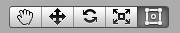
Every UI element is represented as a rectangle for layout purposes. This rectangle can be manipulated in the Scene View using the Rect Tool in the toolbar. The Rect Tool is used both for Unity’s 2D features and for UI, and in fact can be used even for 3D objects as well.
Rect Tool を用いれば、周囲の UI 要素を移動させ、大きさを変更し、回転するなどのことをすべて行うことができます。UI 要素を一度選択すれば、矩形内のどこかをクリックしてドラッグすれば移動させることができます。端か角をクリックして、ドラッグすれば大きさを変更することができます。マウスカーソルが回転シンボルを表示するまでカーソルを角から離せば要素を回転させることもできます。シンボルが表示されたら回転させるためにどちらの方向にでもクリックして、ドラッグすることができます。
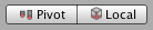
他のツール同様に、Rect Tool はツールバーで設定されている現在のピボットモードとスペースを使用します。UI を操作するときは、普段は Pivot と Local を設定するとよいでしょう。
Rect Transform
The Rect Transform is a new transform component that’s used for all UI elements instead of the regular Transform component.
Rect Transform は一般的な Transform と同様に位置(position)、回転(rotation)、スケール(scale)を有していますが、矩形の寸法を特定するために幅(width)と高さ(height) も有しています。
リサイジング VS スケーリング
When the Rect Tool is used to change the size of an object, normally for Sprites in the 2D system and for 3D objects it will change the local scale of the object. However, when it’s used on an object with a Rect Transform on it, it will instead change the width and the height, keeping the local scale unchanged. This resizing won’t affect font sizes or the border on sliced images.
ピボット(Pivot)
回転(rotation)、サイズ(size)、スケール(scale) の修正はピボットの周囲で起こりますので、ピボットの位置は回転、リサイジング、スケーリングの結果に影響します。ツールバーの Pivot ボタンが Pivot モードに設定されている場合、Rect Transform のピボットは Scene View で移動させることができます。

アンカー(anchor)
Rect Transforms include a layout concept called anchors. Anchors are shown as four small triangular handles in the Scene View and anchor information is also shown in the Inspector.
Rect Transform の親も Rect Transform であれば、子の Rect Transform はさまざまな方法で親の Rect Transform に固定することができます。例えば、子は親の中心か、角の一つに固定することができます。

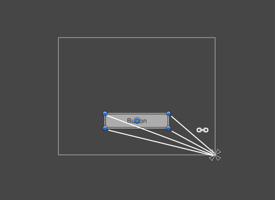
固定(anchoring)は、親の width か height と共に子を引き伸ばすことを可能にします。矩形のそれぞれの隅は対応するアンカーに対して固定のオフセットを有します。すなわち、矩形の左上隅は左上のアンカーに対して固定のオフセットを有する、といったものです。このように、矩形の異なる隅を親矩形の異なる点に固定することができます。
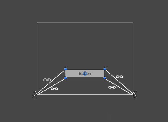
The positions of the anchors are defined in fractions (or percentages) of the parent rectangle width and height. 0.0 (0%) corresponds to the left or bottom side, 0.5 (50%) to the middle, and 1.0 (100%) to the right or top side. But anchors aren’t limited to the sides and middle; they can be anchored to any point within the parent rectangle.
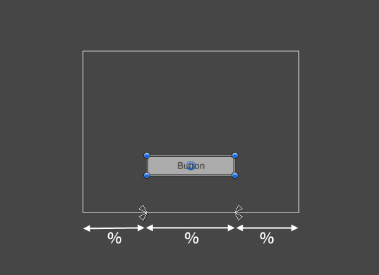
You can drag each of the anchors individually, or if they’re together, you can drag them together by clicking in the middle in between them and dragging. If you hold down Shift key while dragging an anchor, the corresponding corner of the rectangle will move together with the anchor.
アンカーハンドルの便利な特徴は、正確な位置決めを可能とするために、ハンドルが自動的に兄弟矩形のアンカーに対してスナップすることです。
アンカープリセット
In the Inspector, the Anchor Preset button can be found in the upper left corner of the Rect Transform component. Clicking the button brings up the Anchor Presets dropdown. From here you can select from some of the most common anchoring options. You can anchor the UI element to the sides or middle of the parent, or stretch together with the parent size. The horizontal and vertical anchoring is independent.
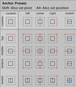
Anchor Presets ボタンは、選択されているものが一つであれば、現在選択されているプリセットオプションを表示します。水平、または垂直軸上のアンカーがプリセットのいずれとも異なる場所に設定されている場合、カスタムオプションが表示されます。
インスペクターでのアンカーと位置の場所
You can click the Anchors expansion arrow to reveal the anchor number fields if they are not already visible. Anchor Min corresponds to the lower left anchor handle in the Scene View, and Anchor Max corresponds to the upper right handle.
矩形の位置フィールドは、アンカーが一緒になっているか(fixed width と height を生成する)分離されているか(矩形が親矩形とともに伸縮する原因となる)に応じて異なった表示をされます。
When all the anchor handles are together the fields displayed are Pos X, Pos Y, Width, and Height. The Pos X and Pos Y values indicate the position of the pivot relative to the anchors.
When the anchors are separated the fields can change partially or completely to Left, Right, Top, and Bottom. These fields define the padding inside the rectangle defined by the anchors. The Left and Right fields are used if the anchors are separated horizontally and the Top and Bottom fields are used if they’re separated vertically.
Note that changing the values in the anchor or pivot fields will normally counter-adjust the positioning values in order to make the rectangle stay in place. In cases where this isn’t desired, enable Raw edit mode by clicking the R button in the Inspector. This causes the anchor and pivot value to be able to be changed without any other values changing as a result. This will likely cause the rectangle to be visually moved or resized, since its position and size is dependent on the anchor and pivot values.
Copyright © 2023 Unity Technologies
优美缔软件(上海)有限公司 版权所有
"Unity"、Unity 徽标及其他 Unity 商标是 Unity Technologies 或其附属机构在美国及其他地区的商标或注册商标。其他名称或品牌是其各自所有者的商标。
公安部备案号:
31010902002961