- Unity User Manual 2022.3 (LTS)
- 사용자 인터페이스(UI) 생성
- UI 툴킷
- UI Renderer
- Use Vector API to create a radial progress indicator
Use Vector API to create a radial progress indicator
Version: 2022.1+
This example demonstrates how to create custom controls and use the Vector API to draw visual content onto a visual element.
개요 예시
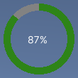
This example creates a custom control that displays progress, as an alternative to a loading bar. The progress indicator displays a progress value in a partially filled ring around a label that displays the percentage. It supports a value between 0 and 100, which determines how much of the ring is filled.

You can find the completed files that this example creates in this GitHub repository.
선행 조건
This guide is for developers familiar with the Unity Editor, UI Toolkit, and C# scripting. Before you start, get familiar with the following:
Create the radial progress control and its custom mesh
Create a C# script to define a RadialProgress visual element and a C# script to define the custom mesh. Style the visual element with a USS file.
Create a Unity project with any template.
Create a folder named
radial-progressto store your files.-
In the
radial-progressfolder, create a C# script namedRadialProgress.cswith the following content:using Unity.Collections; using UnityEngine; using UnityEngine.UIElements; namespace MyUILibrary { // An element that displays progress inside a partially filled circle public class RadialProgress : VisualElement { public new class UxmlTraits : VisualElement.UxmlTraits { // The progress property is exposed to UXML. UxmlFloatAttributeDescription m_ProgressAttribute = new UxmlFloatAttributeDescription() { name = "progress" }; // Use the Init method to assign the value of the progress UXML attribute to the C# progress property. public override void Init(VisualElement ve, IUxmlAttributes bag, CreationContext cc) { base.Init(ve, bag, cc); (ve as RadialProgress).progress = m_ProgressAttribute.GetValueFromBag(bag, cc); } } // Define a factory class to expose this control to UXML. public new class UxmlFactory : UxmlFactory<RadialProgress, UxmlTraits> { } // These are USS class names for the control overall and the label. public static readonly string ussClassName = "radial-progress"; public static readonly string ussLabelClassName = "radial-progress__label"; // These objects allow C# code to access custom USS properties. static CustomStyleProperty<Color> s_TrackColor = new CustomStyleProperty<Color>("--track-color"); static CustomStyleProperty<Color> s_ProgressColor = new CustomStyleProperty<Color>("--progress-color"); Color m_TrackColor = Color.gray; Color m_ProgressColor = Color.red; // This is the label that displays the percentage. Label m_Label; // This is the number that the Label displays as a percentage. float m_Progress; // A value between 0 and 100 public float progress { // The progress property is exposed in C#. get => m_Progress; set { // Whenever the progress property changes, MarkDirtyRepaint() is named. This causes a call to the // generateVisualContents callback. m_Progress = value; m_Label.text = Mathf.Clamp(Mathf.Round(value), 0, 100) + "%"; MarkDirtyRepaint(); } } // This default constructor is RadialProgress's only constructor. public RadialProgress() { // Create a Label, add a USS class name, and add it to this visual tree. m_Label = new Label(); m_Label.AddToClassList(ussLabelClassName); Add(m_Label); // Add the USS class name for the overall control. AddToClassList(ussClassName); // Register a callback after custom style resolution. RegisterCallback<CustomStyleResolvedEvent>(evt => CustomStylesResolved(evt)); // Register a callback to generate the visual content of the control. generateVisualContent += GenerateVisualContent; progress = 0.0f; } static void CustomStylesResolved(CustomStyleResolvedEvent evt) { RadialProgress element = (RadialProgress)evt.currentTarget; element.UpdateCustomStyles(); } // After the custom colors are resolved, this method uses them to color the meshes and (if necessary) repaint // the control. void UpdateCustomStyles() { bool repaint = false; if (customStyle.TryGetValue(s_ProgressColor, out m_ProgressColor)) repaint = true; if (customStyle.TryGetValue(s_TrackColor, out m_TrackColor)) repaint = true; if (repaint) MarkDirtyRepaint(); } void GenerateVisualContent(MeshGenerationContext context) { float width = contentRect.width; float height = contentRect.height; var painter = context.painter2D; painter.lineWidth = 10.0f; painter.lineCap = LineCap.Butt; // Draw the track painter.strokeColor = m_TrackColor; painter.BeginPath(); painter.Arc(new Vector2(width * 0.5f, height * 0.5f), width * 0.5f, 0.0f, 360.0f); painter.Stroke(); // Draw the progress painter.strokeColor = m_ProgressColor; painter.BeginPath(); painter.Arc(new Vector2(width * 0.5f, height * 0.5f), width * 0.5f, -90.0f, 360.0f * (progress / 100.0f) - 90.0f); painter.Stroke(); } } }
Use the custom control in a UI Document and test
Create a USS file to style the radial progress indicator custom control. Use UI Builder to add the control and apply the USS stylesheet. Test the control with different Progress values.
-
Create a USS file named
RadialProgress.usswith the following content:.radial-progress { min-width: 26px; min-height: 20px; --track-color: rgb(130, 130, 130); --progress-color: rgb(46, 132, 24); --percentage-color: white; margin-left: 5px; margin-right: 5px; margin-top: 5px; margin-bottom: 5px; flex-direction: row; justify-content: center; width: 100px; height: 100px; } .radial-progress__label { -unity-text-align: middle-left; color: var(--percentage-color); } Create a UI Document named
RadialProgressExample.uxml.Double-click
RadialProgressExample.uxmlto open it in the UI Builder.In the Library window, select Project > Custom Controls > MyUILibrary.
Drag RadialProgress to the Hierarchy window.
In the StyleSheets section of the UI Builder, add
RadialProgress.ussas existing USS.In the Hierarchy window, select RadialProgress.
In the Inspector window, enter
radial-progressin the Name box.In the Inspector window, enter different values in the Progress box. The percentage in the Viewport changes, and the green progress ring resizes.
Use the progress indicator in runtime
Use the UI Document in a scene, and create a C# MonoBehaviour script to update the Progress property of the control with dynamic values for demo purposes.
-
In the
radial-progressfolder, create a C# script namedRadialProgressComponent.cswith the following content:using System.Collections; using System.Collections.Generic; using UnityEngine; using UnityEngine.UIElements; using MyUILibrary; [RequireComponent(typeof(UIDocument))] public class RadialProgressComponent : MonoBehaviour { RadialProgress m_RadialProgress; void Start() { var root = GetComponent<UIDocument>().rootVisualElement; m_RadialProgress = new RadialProgress() { style = { position = Position.Absolute, left = 20, top = 20, width = 200, height = 200 } }; root.Add(m_RadialProgress); } void Update() { // For demo purpose, give the progress property dynamic values. m_RadialProgress.progress = ((Mathf.Sin(Time.time) + 1.0f) / 2.0f) * 60.0f + 10.0f; } } In Unity, select GameObject > UI Toolkit > UI Document.
Select the UIDocument in the Hierarchy window.
Add RadialProgressComponent.cs as a component of the UIDocument GameObject.
Enter play mode. The progress indicator appears in the scene, and the progress ring and value change dynamically.