Pseudo-classes
A pseudo-class narrows a selector’s scope so it only matches elements when they enter a specific state.
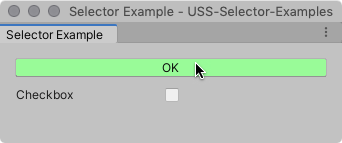
Append a pseudo-class to a simple selector to match specific elements when they’re in a specific state. For example, the following USS rule uses the :hover pseudo-class to change the color of Button elements when a user hovers the pointer over them.
Button:hover {
    background-color: palegreen;
}

Supported pseudo-classes
The following table lists supported pseudo-classes. You can’t extend pseudo-classes or create custom ones.
| Pseudo-class | Matches an element when |
|---|---|
:hover |
The cursor is positioned over the element. |
:active |
A user interacts with the element. |
:inactive |
A user stops to interact with the element. |
:focus |
The element has focus. |
:selected |
USS doesn’t support this pseudo-state. Use :checked instead. |
:disabled |
The element is in a disabled state. |
:enabled |
The element is in an enabled state. |
:checked |
The element is a ToggleA checkbox that allows the user to switch an option on or off. More info See in Glossary or RadioButton element and it’s selected. |
:root |
The element is the highest-level element in the visual treeAn object graph, made of lightweight nodes, that holds all the elements in a window or panel. It defines every UI you build with the UI Toolkit. See in Glossary. |
Chain pseudo-classes
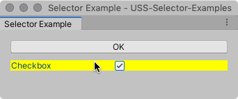
You can chain pseudo-classes together to apply the same style for multiple concurrent states. For example, the following USS rule chains the :checked and :hover pseudo-classes together to change the color of checked Toggle elements when a user hovers the pointer over them.
Toggle:checked:hover {
  background-color: yellow;
}

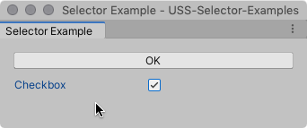
When the toggle is checked, but the pointer isn’t hovering over it, the selector no longer matches.

The root pseudo-class
The :root pseudo-class matches the highest element in a visual tree. It’s slightly different from other supported pseudo-classes because you use it by itself to define default styles for the elements the style sheet affects.
For example, the following USS rule sets a default font. Any element that doesn’t get its font from a more specific style rule uses that font.
:root {
  -unity-font: url("../Resources/fonts/OpenSans-Regular.ttf");
}
A common use for the :root selector is to declare “global” variables (custom properties), that other style rules can use instead of specific values.