Pseudo-classes
A pseudo-class narrows a selector’s scope so it only matches elements when they enter a specific state.
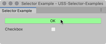
Append a pseudo-class to a simple selector to match specific elements when they’re in a specific state. For example, the following USS rule uses the :hover pseudo-class to change the color of Button elements when a user hovers the pointer over them.
Button:hover {
    background-color: palegreen;
}

Supported pseudo-classes
The following table lists supported pseudo-classes. You can’t extend pseudo-classes or create custom ones.
| Pseudo-class | Matches an element when |
|---|---|
:hover |
The cursor is positioned over the element. |
:active |
A user interacts with the element. |
:inactive |
A user stops to interact with the element. |
:focus |
The element has focus. |
:selected |
USS doesn’t support this pseudo-state. Use :checked instead. |
:disabled |
The element is in a disabled state. |
:enabled |
The element is in an enabled state. |
:checked |
The element is a ToggleA checkbox that allows the user to switch an option on or off. More info See in Glossary or RadioButton element and it’s selected. |
:root |
The element is the highest-level element in the visual treeAn object graph, made of lightweight nodes, that holds all the elements in a window or panel. It defines every UI you build with the UI Toolkit. See in Glossary that has the stylesheet applied. |
Chain pseudo-classes
You can chain pseudo-classes together to apply the same style for multiple concurrent states. For example, the following USS rule chains the :checked and :hover pseudo-classes together to change the color of checked Toggle elements when a user hovers the pointer over them.
Toggle:checked:hover {
  background-color: yellow;
}

When the toggle is checked, but the pointer isn’t hovering over it, the selector no longer matches.

The root pseudo-class
The :root pseudo-class matches the highest-level element that the stylesheet is applied to.
Set default values with the root pseudo-class
You can use the :root pseudo-class to set default style values for inherited styles across elements. To see which USS properties are inherited, refer to the USS properties reference.
For example, the following USS rule sets a default font. If you apply the stylesheet to the root element in the visual tree, any element that doesn’t get its font from a more specific style rule uses that font.
:root {
  -unity-font: url("../Resources/fonts/OpenSans-Regular.ttf");
}
Use custom properties with the root pseudo-class
A common use for the :root pseudo-class is to declare “global” variables (custom properties), that other style rules can use instead of specific values. For example, you can define a custom property for a color and use it in other rules:
:root {
  --my-color: #ff0000;
}

Button {
  background-color: var(--my-color);
}
The root pseudo-class matching
In CSS, the :root pseudo-class matches the root element, which is <HTML>. In USS, it can be the root element or any other element in the visual tree. It doesn’t match other elements or the child elements of that element.
For example, if you have the following hierarchy:
var myElement = new VisualElement();
var myElementChild = new VisualElement();
myElement.Add(myElementChild);

var myOtherElement = new VisualElement();
If you add the stylesheet to myElement:
myElement.stylesheets.Add(myStyleSheet);
The :root selector matches myElement but not myElementChild and myOtherElement.
If you add explicitly the stylesheet to myElementChild and myOtherElement:
myElementChild.stylesheets.Add(myStyleSheet);
myOtherElement.stylesheets.Add(myStyleSheet);
In this case, the :root selector matches myElement, myElementChild, and myOtherElement.