控件
控件是图形用户界面的元素,例如按钮、标签或复选框。它包括控件的视觉效果,以及对其进行操作及交互的脚本逻辑。
In UI Toolkit, a control combines a visual elements with scripting into a template that you can use inside a UI panel.
控件可以由单个视觉元素或多个视觉元素的组合组成。
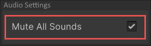
For example, the Toggle control as shown below, contains three elements:
- 文本标签
- 一个框图像
- 一个复选标记的图像
The implementation of the Toggle control defines the behavior of the control. It has an internal value of whether the toggle state is true or false. This logic alternates the visibility of the checkmark image when the value changes.
Add controls to a UI
To use a control in a UI, add it to the Visual Tree. You can add the control through a C# script, UXML, or in the UI Builder.
The following C# code example adds a Button control to an existing visual tree.
var newButton = new Button("Click me!");
rootVisualElement.Add(newButton);
When adding controls to a UI hierarchy, the layout engine automatically handles the sizing and positioning. You can also override the size and position of visual elements.
You can define the look of visual elements with one of the following methods:
- Create a USS file.
- Define the look directly in UI Builder.
- Modify the style property of the element in a C# script.
Interact with controls
Controls are interactive and represent a value that you can change. For example, a FloatField represents a float value. You can create C# scripts to change the value of a control, register a callback, or apply data binding.
Change the control value
To access or change the value of a control, use its value property.
The following C# example creates a Toggle control and a Button control. When you click the button, the value of the toggle flips.
// 创建一个开关并注册回调
m_MyToggle = new Toggle("Test Toggle") { name = "My Toggle" };
rootVisualElement.Add(m_MyToggle);

// 创建切换开关值的按钮
Button button01 = new Button() { text = "Toggle" };
button01.clicked += () =>
{
    m_MyToggle.value = !m_MyToggle.value;
};
rootVisualElement.Add(button01);
For more information about the properties of a specific control, see the UI Toolkit controls reference.
Register a callback
Controls that have value properties send an event if the value changes. You can register a callback to receive this event.
The following code example creates a Toggle control and registers a callback:
// 创建一个开关并注册回调
m_MyToggle = new Toggle("Test Toggle") { name = "My Toggle" };
m_MyToggle.RegisterValueChangedCallback((evt) => { Debug.Log("Change Event received"); });
rootVisualElement.Add(m_MyToggle);
要了解有关回调和事件的更多信息,请参阅事件处理。
Apply data binding
You can bind controls to an object or a serialized property. For example, you can bind a FloatField control to a public float variable that belongs to a MonoBehaviour. When the control binds to the property, it automatically displays the value of the property. When you modify the control, the value of the property updates.
Similarly, when the property value changes via code, the UI displays the updated value. This two-way connection is useful when creating custom Inspector windows.
See Binding for information on data binding.
Not all controls are bindable. For a list of built-in controls and whether they support binding, see UI Toolkit controls reference.
Built-in and custom controls
Unity includes a large range of standard controls, such as labels, text fields, and toggles.
You can also create custom controls, and implement custom logic for user interface elements. For more information, see Custom controls.
Copyright © 2023 Unity Technologies
优美缔软件(上海)有限公司 版权所有
"Unity"、Unity 徽标及其他 Unity 商标是 Unity Technologies 或其附属机构在美国及其他地区的商标或注册商标。其他名称或品牌是其各自所有者的商标。
公安部备案号:
31010902002961