UXML element ListView
C# class: ListView
Namespace: UnityEngine.UIElements
Base class: BaseListView
属性
The following table lists all the supported attributes.
| 名称 | 类型 | 描述 |
|---|---|---|
binding-path |
string |
Path of the target property to be bound. |
content-container |
string |
Returns the content container for the BaseVerticalCollectionView. Because the BaseVerticalCollectionViewcontrol automatically manages its content, this always returns null. |
fixed-item-height |
int |
The height of a single item in the list, in pixels. This property must be set when using the virtualizationMethod is set to FixedHeight, for the collection view to function. |
focusable |
boolean |
True if the element can be focused. |
header-title |
string |
This property controls the text of the foldout header when using showFoldoutHeader. |
name |
string |
The name of this VisualElement. Use this property to write USS selectors that target a specific element. The standard practice is to give an element a unique name. |
picking-mode |
string |
Determines if this element can be pick during mouseEvents or IPanel.Pick queries. |
reorder-mode |
string |
This property controls the drag and drop mode for the list view. The default values is Simple.When this property is set to Animated, Unity adds drag handles in front of every item and the drag anddrop manipulation will push items with an animation as the reordering happens. Multiple item reordering is only supported with the Simple drag mode. |
reorderable |
boolean |
Gets or sets a value that indicates whether the user can drag list items to reorder them. The default values is false.Set this value to true to allow the user to drag and drop the items in the list. The collection viewprovides a default controller to allow standard behavior. It also automatically handles reordering the items in the data source. |
selection-type |
string |
Controls the selection type. The default value is SelectionType.Single.When you set the collection view to disable selections, any current selection is cleared. |
show-add-remove-footer |
boolean |
This property controls whether a footer will be added to the list view. The default values is false.When this property is set to true, Unity adds a footer under the scroll view.This footer contains two buttons: A “+” button. When clicked, adds a single item at the end of the list view. A “-” button. When clicked, removes all selected items, or the last item if none are selected. |
show-alternating-row-backgrounds |
string |
This property controls whether the background colors of collection view rows alternate. Takes a value from the AlternatingRowBackground enum. |
show-border |
boolean |
Enable this property to display a border around the collection view. If set to true, a border appears around the ScrollView that the collection view uses internally. |
show-bound-collection-size |
boolean |
This property controls whether the list view displays the collection size (number of items). The default values is true.When this property is set to true, Unity displays the collection size as the first item in the list, but doesnot make it an actual list item that is part of the list index. If you query for list index 0, Unity returns the first real list item, and not the collection size. If showFoldoutHeader is set to true, the collection size field will be included in the header instead.This property is usually used to debug a ListView, because it indicates whether the data source is linked correctly. In production, the collection size is rarely displayed as a line item in a ListView. SA: UnityEditor.UIElements.BindingExtensions.Bind
|
show-foldout-header |
boolean |
This property controls whether the list view will display a header, in the form of a foldout that can be expanded or collapsed. The default values is false.When this property is set to true, Unity adds a foldout in the hierarchy of the list view and movesthe scroll view inside that newly created foldout. The text of this foldout can be changed with headerTitleproperty on the ListView. If showBoundCollectionSize is set to true, the header will include a TextField to controlthe array size, instead of using the field as part of the list. |
style |
string |
Reference to the style object of this element. Contains data computed from USS files or inline styles written to this object in C#. |
tabindex |
int |
An integer used to sort focusables in the focus ring. Must be greater than or equal to zero. |
tooltip |
string |
Text to display inside an information box after the user hovers the element for a small amount of time. |
usage-hints |
string |
A combination of hint values that specify high-level intended usage patterns for the VisualElement.This property can only be set when the VisualElement is not yet part of a Panel. Once part of a Panel, this property becomes effectively read-only, and attempts to change it will throw an exception.The specification of proper UsageHints drives the system to make better decisions on how to process or accelerate certain operations based on the anticipated usage pattern.Note that those hints do not affect behavioral or visual results, but only affect the overall performance of the panel and the elements within. It’s advised to always consider specifying the proper UsageHints, but keep in mind that some UsageHints might be internally ignored under certain conditions (e.g. due to hardware limitations on the target platform). |
view-data-key |
string |
Used for view data persistence (ie. tree expanded states, scroll position, zoom level). This is the key used to save/load the view data from the view data store. Not setting this key will disable persistence for this VisualElement. |
virtualization-method |
string |
The virtualization method to use for this collection when a scroll bar is visible. Takes a value from the CollectionVirtualizationMethod enum.The default values is FixedHeight.When using fixed height, you need to specify the fixedItemHeight property.Fixed height is more performant but offers less flexibility on content. When using DynamicHeight, the collection will wait for the actual height to be computed.Dynamic height is more flexible but less performant. |
ListView versus ScrollView
You can use a ScrollView control to create the same functionalities as using a ListView. However, a ListView is more efficient than a ScrollView when you do the following:
- Populate list items
- Manage item height
- Bind and unbind to objects
- Instantiate the number of visual elements required to fill a page
- Recycle visual elements to optimize memory handling
Set item height
To change how item height is used to drive content, use the VirtualizationMethod:
-
VirtualizationMethod.FixedHeightsets all items to the same height. -
VirtualizationMethod.DynamicHeightallows items to have varying heights.
Style the ListView
To see which USS selectors affect the component of a ListView at every level of its hierarchy, use the UI Toolkit Debugger:
- In Unity, select Window > UI Toolkit > Debugger.
- In the UI Toolkit Debugger window, select Pick Element and then select the visual element that you want to debug.
The UI Toolkit Debugger window displays the following:
- All child elements of the visual element
- All the USS selectors for each component of the visual element
- Detailed information of each USS selector
Note: The horizontal and vertical Scroller elements are standard UI Toolkit Scrollers.
示例
The best way to learn how to use ListView is to try an example. To see a simple ListView example, in Unity, select Window > UI Toolkit > Samples > List View.
If you want to create a ListView with complex data and bind the ListView to visual elements, do the following:
- Use
makeItemandbindItemto bind the elements to data, register the appropriate callbacks, and modify the linked data source as needed. - Use
unbindItemto recycle an element for the ListView and unbind the data. - Use
destroyItemto clear the registered callbacks.
The following example shows a complex ListView. The example creates a custom Editor window with a list of Characters. Each Character has a slider and a color palette. Moving the slider changes the color of the palette.
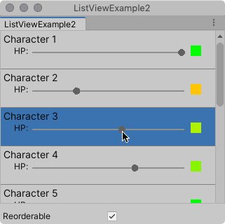
This example builds the visual elements in the list from a C# script. It uses a custom CharacterInfoVisualElement class that inherits from VisualElement, and binds the custom elements to CharacterInfo objects.
You can find the completed files that this example creates in this GitHub repository.
To create the example by yourself:
Create a Unity project with any template.
In the Project window, create a folder named
Editor.-
In the
Editorfolder, create a C# script file namedListViewExamplewith the following content:using System; using System.Collections.Generic; using UnityEditor; using UnityEngine; using UnityEngine.UIElements; public class ListViewExample : EditorWindow { // Gradient used for the HP color indicator. private Gradient hpGradient; private GradientColorKey[] hpColorKey; private GradientAlphaKey[] hpAlphaKey; // ListView is kept for easy reference. private ListView listView; // List of CharacterInfo items, bound to the ListView. private List<CharacterInfo> items; [MenuItem("Window/ListView Custom Item")] public static void OpenWindow() { GetWindow<ListViewExample>().Show(); } private void OnEnable() { SetGradient(); // Create and populate the list of CharacterInfo objects. const int itemCount = 50; items = new List<CharacterInfo>(itemCount); for(int i = 1; i <= itemCount; i++) { CharacterInfo character = new CharacterInfo {name = $"Character {i}", maxHp = 100}; character.currentHp = character.maxHp; items.Add(character); } // The ListView calls this to add visible items to the scroller. Func<VisualElement> makeItem = () => { var characterInfoVisualElement = new CharacterInfoVisualElement(); var slider = characterInfoVisualElement.Q<SliderInt>(name: "hp"); slider.RegisterValueChangedCallback(evt => { var hpColor = characterInfoVisualElement.Q<VisualElement>("hpColor"); var i = (int)slider.userData; var characterInfo = items[i]; characterInfo.currentHp = evt.newValue; SetHp(slider, hpColor, characterInfo); }); return characterInfoVisualElement; }; // The ListView calls this if a new item becomes visible when the item first appears on the screen, // when a user scrolls, or when the dimensions of the scroller are changed. Action<VisualElement, int> bindItem = (e, i) => BindItem(e as CharacterInfoVisualElement, i); // Height used by the ListView to determine the total height of items in the list. int itemHeight = 55; // Use the constructor with initial values to create the ListView. listView = new ListView(items, itemHeight, makeItem, bindItem); listView.reorderable = false; listView.style.flexGrow = 1f; // Fills the window, at least until the toggle below. listView.showBorder = true; rootVisualElement.Add(listView); // Add a toggle to switch the reorderable property of the ListView. var reorderToggle = new Toggle("Reorderable"); reorderToggle.style.marginTop = 10f; reorderToggle.value = false; reorderToggle.RegisterValueChangedCallback(evt => listView.reorderable = evt.newValue); rootVisualElement.Add(reorderToggle); } // Sets up the gradient. private void SetGradient() { hpGradient = new Gradient(); // HP at 0%: Red. At 10%: Dark orange. At 40%: Yellow. At 100%: Green. hpColorKey = new GradientColorKey[4]; hpColorKey[0] = new GradientColorKey(Color.red, 0f); hpColorKey[1] = new GradientColorKey(new Color(1f, 0.55f, 0f), 0.1f); // Dark orange hpColorKey[2] = new GradientColorKey(Color.yellow, 0.4f); hpColorKey[3] = new GradientColorKey(Color.green, 1f); // Alpha is always full. hpAlphaKey = new GradientAlphaKey[2]; hpAlphaKey[0] = new GradientAlphaKey(1f, 0f); hpAlphaKey[1] = new GradientAlphaKey(1f, 1f); hpGradient.SetKeys(hpColorKey, hpAlphaKey); } // Bind the data (characterInfo) to the display (elem). private void BindItem(CharacterInfoVisualElement elem, int i) { var label = elem.Q<Label>(name: "nameLabel"); var slider = elem.Q<SliderInt>(name: "hp"); var hpColor = elem.Q<VisualElement>("hpColor"); slider.userData = i; CharacterInfo characterInfo = items[i]; label.text = characterInfo.name; SetHp(slider, hpColor, characterInfo); } private void SetHp(SliderInt slider, VisualElement colorIndicator, CharacterInfo characterInfo) { slider.highValue = characterInfo.maxHp; slider.SetValueWithoutNotify(characterInfo.currentHp); float ratio = (float)characterInfo.currentHp / characterInfo.maxHp; colorIndicator.style.backgroundColor = hpGradient.Evaluate(ratio); } // This class inherits from VisualElement to display and modify data to and from a CharacterInfo. public class CharacterInfoVisualElement : VisualElement { // Use Constructor when the ListView uses makeItem and returns a VisualElement to be // bound to a CharacterInfo data class. public CharacterInfoVisualElement() { var root = new VisualElement(); // The code below to style the ListView is for demo purpose. It's better to use a USS file // to style a visual element. root.style.paddingTop = 3f; root.style.paddingRight = 0f; root.style.paddingBottom = 15f; root.style.paddingLeft = 3f; root.style.borderBottomColor = Color.gray; root.style.borderBottomWidth = 1f; var nameLabel = new Label() {name = "nameLabel"}; nameLabel.style.fontSize = 14f; var hpContainer = new VisualElement(); hpContainer.style.flexDirection = FlexDirection.Row; hpContainer.style.paddingLeft = 15f; hpContainer.style.paddingRight = 15f; hpContainer.Add(new Label("HP:")); var hpSlider = new SliderInt {name = "hp", lowValue = 0, highValue = 100}; hpSlider.style.flexGrow = 1f; hpContainer.Add(hpSlider); var hpColor = new VisualElement(); hpColor.name = "hpColor"; hpColor.style.height = 15f; hpColor.style.width = 15f; hpColor.style.marginRight = 5f; hpColor.style.marginBottom = 5f; hpColor.style.marginLeft = 5f; hpColor.style.backgroundColor = Color.black; hpContainer.Add(hpColor); root.Add(nameLabel); root.Add(hpContainer); Add(root); } } // Basic data class used for a character, with a name and HP data. Use a list of CharacterInfo as // a data source for the ListView. The CharacterInfo can be bound to CharacterInfoVisualElement when needed. [Serializable] public class CharacterInfo { public string name; public int maxHp; public int currentHp; } } To see the example live, from the menu, select Window > ListView Custom Item.
其他资源
Copyright © 2023 Unity Technologies
优美缔软件(上海)有限公司 版权所有
"Unity"、Unity 徽标及其他 Unity 商标是 Unity Technologies 或其附属机构在美国及其他地区的商标或注册商标。其他名称或品牌是其各自所有者的商标。
公安部备案号:
31010902002961