Getting started with UIElements
UIElements is a new experimental feature introduced in Unity 2017.1.
It is recommended that you look at the example project as you read through this document.
The example project is located at https://github.com/Unity-Technologies/UIElementsExamples.
Disclaimer: *this experimental feature is incomplete and subject to API changes. While we appreciate any feedback, please remember that UIElements is still in active development.
Also, please note that changes introduced in 2017.2 won’t be backported to 2017.1.*
Introduction
So far the Unity editor user interface has been mostly built around the immediate mode UI system. While IMGUI shines in some contexts it has some serious design limitations which are affecting the productivity of everyone working on Editor features.
This was our motivation to start working on UIElements, a retained-mode UI system that opens the door to improved performance and new features such as stylesheets, dynamic/contextual event handling, accessibility and much more.
Visual tree
The visual tree is an object graph made of lightweight nodes called “visual elements”. This is a graph that can be traversed for event processing, layout and painting. These nodes are allocated on the C# heap, either manually or via asset loading in the future.
VisualContainer and VisualElement
VisualElement is the common base class for all nodes of the visual tree. The VisualElement base class contains properties for styles, layout data, local transformations, event handlers, and so on.
VisualElement has several subclasses, including VisualContainer and specialized controls, which define additional behaviour or functionality. However, it is not strictly required to derive from any class to work with UIElements, as built-in classes should contain most of the required functionality.
A VisualContainer object contains VisualElement child objects. The VisualContainer class has several methods to work with its list of children.
Note: UIElements classes are currently inside of the UnityEngine.Experimental.UIElements namespace.
Connectivity
A newly created element is ignored until connected to the root object, called the “panel”. You usually add elements to an existing container object, such as EditorWindow.rootVisualContainer, to attach your UI to the panel.
Note: to prevent accidental usage of this property while UIElements is experimental, it’s necessary to go through the extension method GetRootVisualContainer() from the UnityEditor.Experimental.UIElements namespace.
To test if a VisualElement is connected to a root, you can test for the panel property of this element (null if not connected).
Painting order
Elements of the tree are drawn in the following order:
parents are drawn before their children
siblings are painted in the order of their parent’s children list
The only way to change painting order is thus to re-order VisualElement objects in their parents.
It is possible to draw a given subtree in a RenderTexture and re-use the pixels for later repaint events by enabling VisualContainer.usePixelCaching.
Note: It is possible to implement custom painting by subclassing VisualElement and overriding the DoRepaint() method, however we do not recommend this approach as it will change in future releases.
Position, transforms and coordinate systems
The layout system affects each VisualElement.position property (of type Rect). This rect is expressed as pixels in relation to the coordinate space of its parent. You can assign this position manually as shown in the first example script.
Each VisualElement also has a transform property (of type Matrix4x4) which transform its local coordinates space (before taking in account the position rectangle) from its parent space.
The final VisualElement window space coordinates can be retrieved via the globalBound property, taking account of transforms and positions of the full ancestry of a VisualElement.
Note: in 2017.2, we will replace transform by Translate, Rotate and Scale properties for VisualElement, similar to Unity’s Transform component.
The VisualElementExtensions static class contains several extensions to perform transformations between coordinates system.
Layout
VisualElement and VisualContainer classes contain several properties to control the layout. By default all elements are part of the layout, with the following default behaviours:
Containers will distribute their children vertically
Container’s position rectangles will encompass their children’s rectangles (unless explicitly restricted by other layout properties)
VisualElement with text will measure their text and size themselves accordingly (unless explicitly restricted by other layout properties)
Default controls also come with pre-defined styles which will affect their layout
Layout in UIElements is relying on the Yoga open source project, which implements a subset of the HTML/CSS layout system called Flexbox.
Here are some resources to help you get started with Flexbox:
Yoga’s own documentation : mapping of properties is almost entirely 1-to–1
CSS-Tricks guide to Flexbox : most properties are supported with some minor differences
However here is a quick layout cheat sheet:
In the most basic cases, you can simply assign
widthandheightto elements in order to give them a sizeFlexible size can be given via the
flexproperty, which acts as weight of an element in regards to its siblings.You can switch to horizontal layout by assigning the
flexDirectionproperty to RowRelative positioning lets you offset an element based on its original layout position
Absolute positioning lets you place an element relative to its parent position rectangle, in which case it does not contribute affect the layout of its siblings or parent
Elements which have their “position” property assigned directly via the API will be automatically considered as “absolute”
To prevent elements from stretching in the cross-axis, assign
FlexStartto thealignSelfproperty of eachVisualElementchild object or the parent’salignItemsproperty
Styles
A VisualElement has style properties that can either be set directly in C# or applied from a stylesheet. In addition to layout properties, there also exist several properties affecting the way an element is drawn on screen, such as backgroundColor or borderColor.
Note: in 2017.2, all style properties of VisualElement will be extracted to a separate data structure to remove ambiguity between style-driven properties and non-style properties.
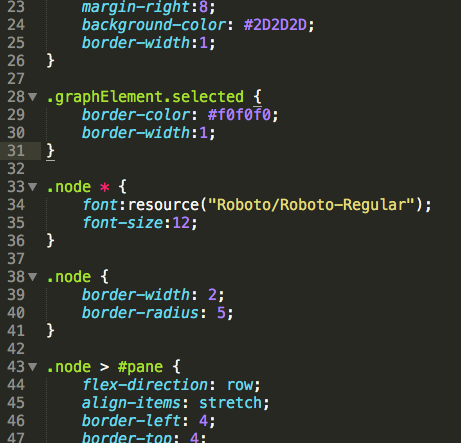
Style sheets are supported in Unity via the USS file format. Please refer to this document for detailed information about USS : Unity Style Sheets Reference.
Once you’ve successfully created your style sheets in Unity, you can associate a stylesheet to your VisualContainer via the AddStyleSheetPath() method.
ノート
The style sheet needs to be placed inside an “Resources” or “Editor Default Resources” folder in your Assets folder
The path provided to the aforementioned method is relative to the enclosing folder
Style sheets modified while used in a running
EditorWindowtake effect immediately and should re-style your UI accordinglyStyle sheets can be attached to any
VisualContainerand thus their rules apply to all descendants of this container
Events
Input events are directly propagated to VisualElement objects. The logic varies slightly depending on the type of event and other factors :
Mouse events are propagated to the element under the mouse
Keyboard events are propagated to the focused element
A control can take the “capture” and receive all events directly (for example, a button takes the capture on mouse down and releases it on mouse up)
Events are said to be propagated because each ancestor of the target object can intercept an event before its descendants (Capture phase) or after its descendants if not stopped (BubbleUp phase). You might be familiar with this pattern from the HTML or Flash event models.

If an element has taken the capture (via the extension method TakeCapture()), it will receive the event directly and no propagation will occur. However, if it does not use the event it will be propagated normally.
An element that is not visible or enabled will not receive events. However, the events will still be propagated in the hierarchy..
Adding event handlers
There are two ways two write event handling code:
Override the
HandleEvent()method in yourVisualElementsubclassSubclass Manipulator and override the
HandleEvent()method in your subclass, then addVisualElement.AddManipulator()
You must return EventPropagation.Continue or EventPropagation.Stop depending on how you want to control the propagation. The finalTarget argument will be set to the target object.
Note: in 2017.2, we will move away from the IMGUI Event class and remove the need to write subclass to handle events. Instead, new event types will be introduced alongside an event registration model based on callbacks.
Picking mode and custom shapes
The VisualElement class has a pickingMode property which supports two values :
PickingMode.Position(default) : perform picking based on the position rectanglePickingMode.Ignore: prevent from being picked as the result of a mouse event
It’s possible to override the VisualElement.ContainsPoint() method to perform custom intersection logic.
Controls
A few standard controls are built in UIElements :
ButtonToggleLabelScrollViewTextFieldandEditorTextField
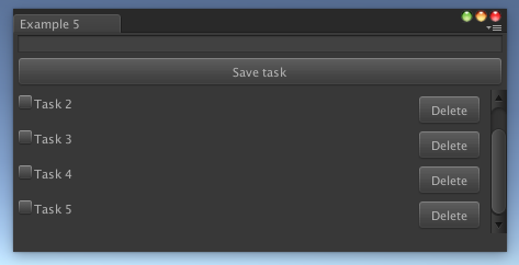
Please refer to the example project for example usage of controls.
IMGUI Support
The IMGUIContainer class lets you use IMGUI code inside of a VisualElement. Everything you can normally do inside of OnGUI() is supported. It’s also possible to arrange multiple IMGUIContainer and lay them out correctly by mixing GUILayout and UIElements layout.
However, it’s not possible use UIElements inside of an IMGUIContainer.
Copyright © 2023 Unity Technologies
优美缔软件(上海)有限公司 版权所有
"Unity"、Unity 徽标及其他 Unity 商标是 Unity Technologies 或其附属机构在美国及其他地区的商标或注册商标。其他名称或品牌是其各自所有者的商标。
公安部备案号:
31010902002961