ギズモメニュー
Scene ビュー と Game ビュー の両方にギズモメニューがあります。ギズモメニューにアクセスするには、Scene ビュー、または Game ビューのツールバーの Gizmos ボタンをクリックします。

| プロパティー | 機能 |
|---|---|
| 3D Icons |
3D Icons チェックボックスは、シーンビューでコンポーネントのアイコン (ライトやカメラのアイコンなど) を 3D で描画するかどうかを制御します。 3D Icons をチェックすると、カメラからの距離に応じてコンポーネントのアイコンは伸縮し、シーンのゲームオブジェクトによって隠されます。全体的な見かけのサイズを制御するには、スライダーを使用します。3D Icons を選択しないときは、コンポーネントアイコンは固定サイズで描画され、シーンビューで常にゲームオブジェクトの前面に描画されます。 画像やその他の詳細 に関しては、後述の ギズモとアイコン を参照してください。 |
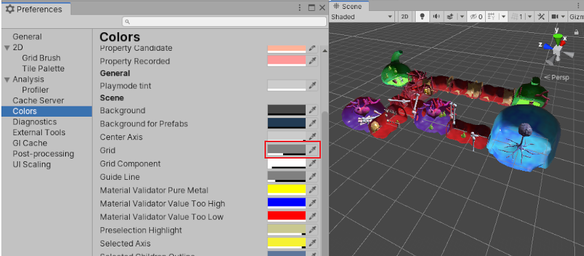
| Show Grid | The Show Grid checkbox switches the standard Scene measurement grid on (checked) and off (unchecked) in the Scene view. To change the colour of the grid, go to Unity > Preferences (macOS) or Edit > Preferences__ (Windows), select Colors, and alter the Grid setting. This option is only available in the Scene view Gizmos menu; you cannot enable it in the Game view Gizmos menu. See Show Grid, below, for images and further information. |
| Selection Outline |
Selection Outline をチェックすると、選択したゲームオブジェクトを色の付いた輪郭にし、子を異なる色の輪郭で表示します。デフォルトでは、選択されたゲームオブジェクトはオレンジ色で表示され、子ゲームオブジェクトは青色で表示されます。 注意: このオプションは、シーンビューのギズモメニューでのみ使用できます。ゲームビューのギズモメニューでは有効にできません。 画像とその他の情報は、後述の Selection Outline と Selection Wire を参照してください。 |
| Selection Wire | Check Selection Wire to show the selected GameObjects with their wireframe Mesh visible. To change the colour of the Selection Wire, go to Unity > Preferences (macOS) or Edit > Preferences__ (Windows), select Colors, and alter the Selected Wireframe setting. This option is only available in the Scene view Gizmos menu; you cannot enable it in the Game view Gizmos menu. See Selection Outline and Selection Wire, below, for images and further information. |
| Recently Changed | Controls the visibility of the icons and gizmos for components and scripts that you modified recently. This section appears the first time you change one or more items, and updates after subsequent changes. For more information, see Built-in components, scripts, and recently changed items, below. |
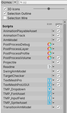
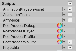
| Scripts | Controls the visibility of the icons and gizmos for scripts in the Scene. This section appears only when your Scene uses scripts that meet specific criteria. See Built-in components, scripts, and recently changed items, below, for further information. |
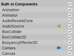
| Built-in Components | Controls the visibility of the icons and gizmos for all component types that have an icon or gizmo. See Built-in components, scripts, and recently changed items, below, for further information. |
ギズモとアイコン
ギズモ
ギズモ は、シーン内のゲームオブジェクトに関連付けられたグラフィックスです。一部のギズモはゲームオブジェクトが選択されたときにのみ描画され、他のギズモは選択されたゲームオブジェクトに関係なく描画されます。 それらは通常、ビットマップグラフィックスではなくコードで描画されたワイヤフレームで、相互作用が可能です。カメラ のギズモと ライト方向 のギズモ (下の図) は、両方ともビルトインギズモの例です。スクリプトを使用して独自のギズモを作成することもできます。カメラの詳細については、 視錐台を理解する を参照してください。
一部のギズモは受動的な図のオーバーレイで、参考のために表示されます (ライトの向きを示す ライト方向 のギズモなど)。 他のギズモは相互作用可能なものです。例えば、オーディオソース の 球面範囲 ギズモは、クリックしてドラッグするとオーディオソースの最大範囲を調整できます。
Move、Scale、Rotate、Transform ツールは、相互作用が可能なギズモです。 これらの詳細については、ゲームオブジェクトの配置 を参照してください。

スクリプトでカスタムのギズモを実装するための詳細は、 OnDrawGizmos 関数のスクリプトリファレンスを参照してください。
アイコン
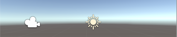
ゲームビューまたはシーンビューに アイコン を表示できます。それらはフラットなビルボードスタイルのオーバーレイで、ゲームの作業中にゲームオブジェクトの位置を明確に示すために使用します。カメラ アイコンと ライト アイコンは、ビルトインアイコンの例です。ゲームオブジェクトや個々のスクリプトに独自のアイコンを割り当てることもできます (これを行う方法は、アイコンの割り当て を参照してください)。
Show Grid
Show Grid 機能は、シーンの平面上のグリッドを切り替えます。下の画像は、これがシーンビューでどのように表示されるかを示しています。
To change the colour of the grid, go to Unity > Preferences (macOS) or Edit > Preferences__ (Windows), select Colors and alter the Grid setting. In this image, the Scene view grid is colored dark blue so that it shows up better against the light-colored floor:
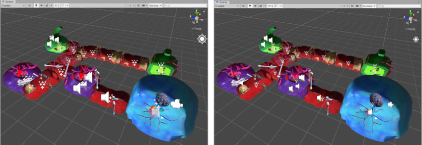
Selection Outline と Selection Wire
Selection Outline
Selection Outline を有効にすると、選択したゲームオブジェクトとその子ゲームオブジェクトの周囲に輪郭が表示されます。デフォルトでは、選択されたゲームオブジェクトはオレンジ色で表示され、子ゲームオブジェクトは青色で表示されます。これらの色は Unity の Preferences (環境設定) で変更できます (後述の Selection Colors を参照してください)。

ゲームオブジェクトを選択すると、Unity はすべての子ゲームオブジェクト (子ゲームオブジェクトなどを含む子孫オブジェクト) の輪郭をハイライト表示しますが、親ゲームオブジェクト (親ゲームオブジェクトを含む先祖オブジェクト) の輪郭はハイライト表示しません。
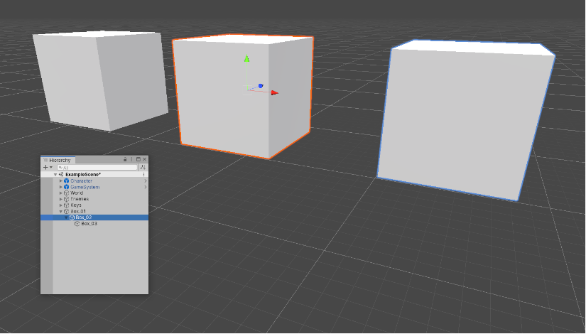
選択したゲームオブジェクトがシーンビューの端を超えている場合、選択した輪郭はウィンドウの端に沿って表示されます。
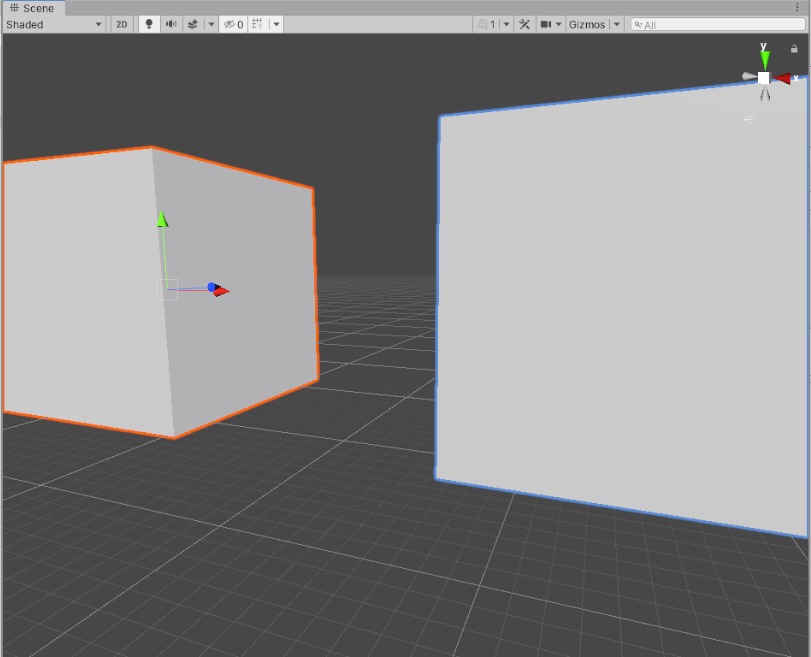
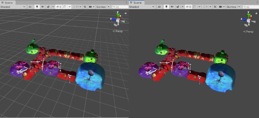
Selection Wire
Selection Wire を有効にして、シーンビューまたは Hierarchy ウィンドウでゲームオブジェクトを選択すると、そのゲームオブジェクトのワイヤフレーム状のメッシュがシーンビューで表示されます。
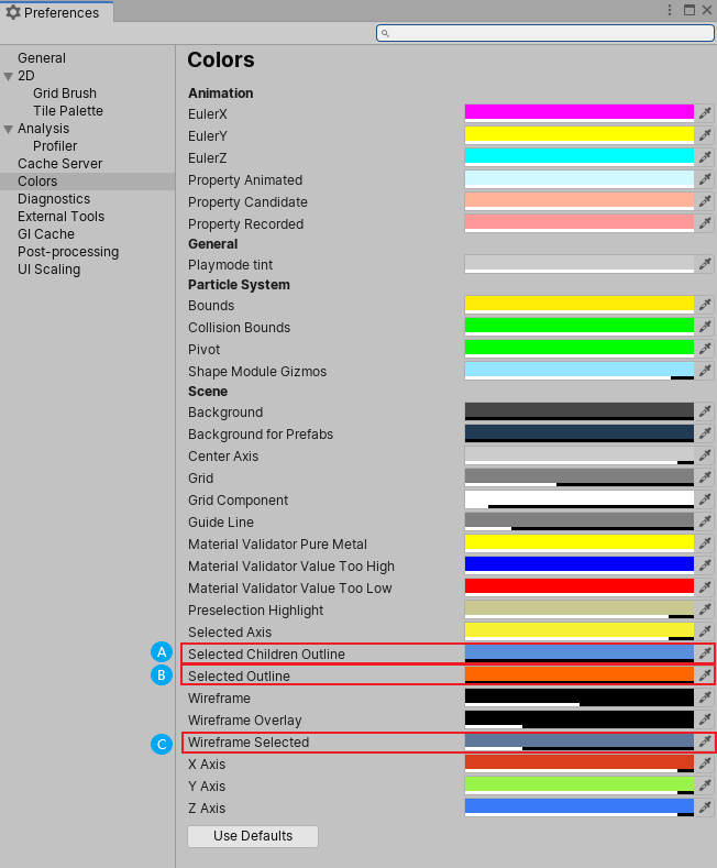
色の設定
選択したワイヤーフレームにカスタム色を設定することができます。
- Go to Unity > Preferences (macOS) or Edit > Preferences__ (Windows) to open the Preferences editor.
- Color タブで、以下の色の 1 つ以上を変更します。
- (A)Selected Children Outline: 選択したゲームオブジェクトの子オブジェクトの輪郭の色
- (B)Selected Outline: 選択したゲームオブジェクトの輪郭の色
- (C)Wireframe Selected: 選択したゲームオブジェクトのワイヤーフレームの色
Built-in components, scripts, and recently changed items
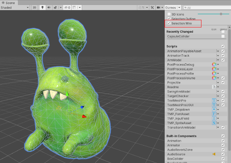
Use the list in the Gizmos menu to control the visibility of icons and gizmos for various components. The list is divided into sections:
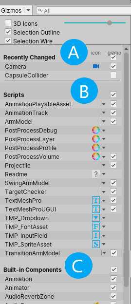
A. The Recently Changed section controls the visibility of the icons and gizmos for items that you’ve modified recently. It appears the first time you change one or more items. Unity updates the list after subsequent changes.
B. The Scripts section controls the visibility of the icons and gizmos for scripts that:
Have an icon assigned to them (see documentation on Assigning icons).
Implement the OnDrawGizmos function.
Implement the OnDrawGizmosSelected function.
This section appears when your Scene contains one or more scripts that meet the above criteria.
C. The Built-in Components section controls the visibility of the icons and gizmos for all component types that have an icon or gizmo.
Built-in component types that do not have an icon or gizmo shown in the Scene view (for example, Rigidbody) are not listed here.
Toggling icon visibility
The icon column shows or hides the icons for each component type. Full-color icons are displayed in the main Scene view window, faded icons are not.
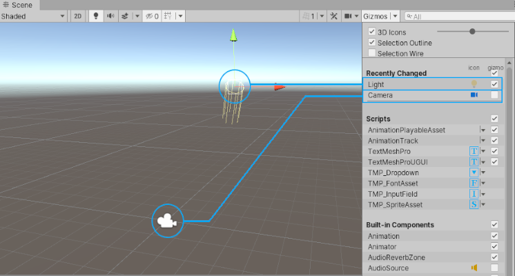
To toggle an icon’s visibility in the Scene view, click any icon in the icon column.
Note: If an item in the list has a gizmo but no icon, the icon column for that item is empty.
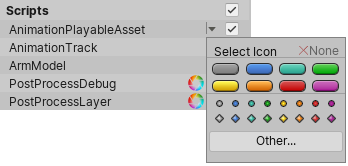
Changing script icons
Scripts with custom icons show a small drop-down menu arrow in the icon column. To change a custom icon, click the arrow to open the Select Icon menu.
Toggling gizmo visibility
To control whether the Editor draws gizmo graphics for a particular component type (for example, a Collider’s wireframe gizmo or a Camera’s view frustum gizmo) or script, use the checkboxes in the Gizmo column.
When a checkbox is checked, the Editor draws gizmos for that component type.
When a checkbox is cleared, the Editor does not draw gizmos for that component type.
Note: If an item in the list has an icon but no gizmo, the Gizmo column for that item is empty.
To toggle gizmo visibility for an entire section (all Built-in Components, all Scripts, and so on), use the checkboxes next to the section names.
When the checkbox is toggled on, gizmo visibility is toggled on for one or more item types in the section.
Copyright © 2023 Unity Technologies
优美缔软件(上海)有限公司 版权所有
"Unity"、Unity 徽标及其他 Unity 商标是 Unity Technologies 或其附属机构在美国及其他地区的商标或注册商标。其他名称或品牌是其各自所有者的商标。
公安部备案号:
31010902002961