USS properties syntax
This page introduces the common USS properties, their syntax and accepted values, and differences from CSS. For a complete list of USS properties, see USS properties reference.
USS properties use the same grammar syntax as W3C CSS documents:
- キーワードの値はそのまま表記します。例:
auto、baseline - 基本的なデータ型は山括弧 (
<と>) の間に表記します。例:<length>、<color> - プロパティと同じ名前を持つ端末以外のものは山括弧 (
<と>) の間に表記します。例:<'width'>
プロパティ値に複数のコンポーネントがある場合は以下の通りです。
- 複数の並列の単語は、すべてが与えられた順序で発生することを意味します。
- A bar (
|) separates two or more alternatives: exactly one must occur. - A double bar (
||) separates two or more options: one or more must occur, in any order. - 2 重アンパサンド (
&&) は、2 つ以上のコンポーネントを区切ります。これらのコンポーネントは任意の順序で発生します。 - 大括弧 (
[]) はグループ化を意味します。
Every type, keyword, or angle-bracketed group might be followed by modifiers:
- アスタリスク (
*) は、前に記述された型、単語、またはグループが 0 回以上発生することを示します。 - プラス (
+) は、前に記述された型、単語、またはグループが 1 回以上発生することを示します。 - 疑問符 (
?) は、前に記述された型、単語、またはグループが必須でないことを示します。 - 中括弧 (
{A,B}) の数字は、前に記述された型、単語、またはグループが少なくともA回、最大でB回発生することを示します。
ボックスモデル

寸法
width: <length> | auto
height: <length> | auto
min-width: <length> | auto
min-height: <length> | auto
max-width: <length> | none
max-height: <length> | none
width と height は要素のサイズを指定します。width が指定されない場合、幅は要素の内容の幅にもとづいて決定されます。height が指定されない場合、高さは要素のコンテンツの高さに基づきます。
マージン
margin-left: <length> | auto;
margin-top: <length> | auto
margin-right: <length> | auto
margin-bottom: <length> | auto
/* Shorthand */
margin: [<length> | auto]{1,4}
境界線
border-left-width: <length>
border-top-width: <length>
border-right-width: <length>
border-bottom-width: <length>
/* Shorthand */
border-width: <length>{1,4}
パディング
padding-left: <length>
padding-top: <length>
padding-right: <length>
padding-bottom: <length>
/* Shorthand */
padding: <length>{1,4}
Differences from CSS
The alternative box model that USS uses is different from the standard CSS box model. In the standard CSS box model, width and height define the size of the content box. An element’s rendered size is the sum of its padding, border-width, and width / height values.
Unityのモデルは、CSSの box-sizing プロパティを border-box に設定することと同じです。詳細は、MDNドキュメント を参照してください。
フレックスレイアウト
UI Toolkit includes a layout engine that positions visual elements based on layout and styling properties. The layout engine implements a subset of Flexbox, an HTML/CSS layout system.
デフォルトでは、すべてのアイテムは垂直にコンテナに配置されます。
/* Items */
flex-grow: <number>
flex-shrink: <number>
flex-basis: <length> | auto
flex: none | [ <'flex-grow'> <'flex-shrink'>? || <'flex-basis'> ]
align-self: auto | flex-start | flex-end | center | stretch

/* Containers */
flex-direction: row | row-reverse | column | column-reverse
flex-wrap: nowrap | wrap | wrap-reverse
align-content: flex-start | flex-end | center | stretch
align-items: flex-start | flex-end | center | stretch
justify-content: flex-start | flex-end | center | space-between | space-around
Positioning
/* The default value is `relative` which positions the element based on its parent.
If sets to `absolute`, the element leaves its parent layout and values are specified based on the parent bounds.*/
position: absolute | relative

/* The distance from the parent edge or the original position of the element. */
left: <length> | auto
top: <length> | auto
right: <length> | auto
bottom: <length> | auto
背景
background-color: <color>
background-image: <resource> | <url> | none
-unity-background-scale-mode: stretch-to-fill | scale-and-crop | scale-to-fit
-unity-background-image-tint-color: <color>
Slicing
When assigning a background image, you draw it with respect to a simplified 9-slice specification:
-unity-slice-left: <integer>
-unity-slice-top: <integer>
-unity-slice-right: <integer>
-unity-slice-bottom: <integer>
-unity-slice-scale: <length>
Border color
border-color: <color>
Border radius
border-top-left-radius: <length>
border-top-right-radius: <length>
border-bottom-left-radius: <length>
border-bottom-right-radius: <length>
/* Shorthand */
border-radius: <length>{1,4}
Differences from CSS
Border radius properties work almost the same in USS and CSS. For detailed information about border-radius, see the MDN documentation.
However, there are two main differences:
- Unity doesn’t support the second-radius shorthand (
border-radius: (first radius values) / (second radius values);) used to create elliptical corners. - Unity reduces border radius values to half of the element’s size in pixels. For example, for a 100px x 100px element, any
border-radiusvalue greater than 50px is reduced to 50px. If you use percentage (%) values for border radius properties, Unity first resolves the percentage to pixels and then reduces theborder-radiusvalue to half of the resolved pixel value. If you have different radius values for two or more corners, Unity reduces any values greater than half of the element’s size to half of the element’s size.
Appearance
overflow: hidden | visible
-unity-overflow-clip-box: padding-box | content-box
-unity-paragraph-spacing: <length>
opacity: <number>
visibility: visible | hidden
display: flex | none
-unity-overflow-clip-box は要素 コンテンツのクリップ面の矩形を定義します。デフォルトは padding-box で、 パディングエリアの外側の矩形 (上のボックスモデルの画像の緑の矩形) です。content-box はパディングエリア (上のボックスモデルの画像の青い矩形) 内の値を表します。
The display default value is flex. Setting display to none removes the element. Setting the visibility to hidden hides the element, but the element still occupies space in the layout.
Differences from CSS
USS display プロパティは、CSS display プロパティの利用可能なキーワード値のごく一部にしか対応していません。USSバージョンでは、Yogaレイアウトエンジンで動作するキーワードをサポートしています。
- ヨガについては、レイアウト を参照してください。
- CSS
displayプロパティの詳細については、MDN documentation を参照してください。
テキストプロパティ
テキストプロパティは、フォント、フォントサイズ、フォントリソースの Unity 特有のプロパティ、フォントスタイル、整列、ワードラップ、クリッピングを設定します。
color: <color>
-unity-font: <resource> | <url>
-unity-font-definition: <resource> | <url>
font-size: <number>
-unity-font-style: normal | italic | bold | bold-and-italic
-unity-text-align: upper-left | middle-left | lower-left | upper-center | middle-center | lower-center | upper-right | middle-right | lower-right
-unity-text-overflow-position: start | middle | end
white-space: normal | nowrap

-unity-text-outline-width: <length>
-unity-text-outline-color: <color>
/* Shorthand */
-unity-text-outline: <length> | <color>
Note: When setting up font in UI Builder, the Font control in the Inspector sets -unity-font, and the Font Asset control sets -unity-font-definition. Because -unity-font-definition takes precedence over -unity-font, if you want to use a font from the Font list, you must select None from Font Asset. Otherwise, the font you selected won’t take effect.
Cursor
cursor のデフォルトテクスチャタイプを使用して、カーソルのカスタムテクスチャをインポートします。
cursor: [ [ <resource> | <url> ] [ <integer> <integer>]? , ] [ arrow | text | resize-vertical | resize-horizontal | link | slide-arrow | resize-up-right | resize-up-left | move-arrow | rotate-arrow | scale-arrow | arrow-plus | arrow-minus | pan | orbit | zoom | fps | split-resize-up-down | split-resize-left-right ]
Differences from CSS
CSSでは、1つの cursor スタイル宣言で、複数のオプションのカスタムカーソルと必須キーワードを指定することができます。複数のカーソルを指定するとこれらはフォールバックの連鎖を形成します。ブラウザが最初のカスタムカーソルを読み込めない場合、他のカスタムカーソルを順に試します。ブラウザは最初のカスタムカーソルを読み込めない場合、他のカスタムカーソルを順番に試し、いずれかが読み込まれるか、試すカスタムカーソルがなくなるまで試します。ブラウザがどのカスタムカーソルも読み込めない場合。キーワードを使用します。
USSでは、カスタムカーソルとキーワードは相互に排他的です。 カーソル スタイル宣言は、1つのカスタムカーソルまたは1つのキーワードしか持つことができません。
CSS cursor プロパティの詳細については、MDN documentation を参照してください。
Opacity
opacityです。<number>
Differences from CSS
USS opacity is similar to CSS opacity. The opacity of parent elements affects the perceived opacity of child elements. The perceivability is different between USS opacity and CSS opacity.
In the following USS example, the blue square is a child of the red square. The red square has an opacity of 0.5.
.red {
    background-color: red;
    opacity: 0.5;
}

.blue {
    background-color: blue;
    left: 20px;
    top: 20px;
}
Although the blue square doesn’t have an opacity value, it has a perceived opacity of 0.5 from the red square. You can see the red square through the blue square.
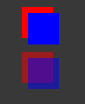
In CSS, if you apply the same styles, both the red and blue squares are 50% transparent. However, you can’t see the red square through the blue square, unless you also set the opacity of blue to be less than 1.

その他の参考資料
Copyright © 2023 Unity Technologies
优美缔软件(上海)有限公司 版权所有
"Unity"、Unity 徽标及其他 Unity 商标是 Unity Technologies 或其附属机构在美国及其他地区的商标或注册商标。其他名称或品牌是其各自所有者的商标。
公安部备案号:
31010902002961