- Unity User Manual 2022.2
- Create user interfaces (UI)
- UI Toolkit
- Style UI
- USS properties
- Position element with the layout engine
Position element with the layout engine
UI Toolkit includes a layout engine that positions elements based on layout and styling properties. The layout engine uses the layout principles of Yoga, which implements a subset of Flexbox, a HTML/CSS layout system. UI Toolkit properties match Yoga layout behavior. UI Toolkit supports most properties in Flexbox.
By default, all elements are part of the layout. The layout has the following default behaviours:
- コンテナは子を垂直に配置します。
- コンテナ矩形の位置は子の矩形を含みます。この動作は他のレイアウトプロパティによって制限される場合があります。
- A
VisualElementwith text uses the text size in its size calculations. This behavior can be limited by other layout properties.
UI Toolkit includes built-in controls for standard UI components, such as a button, toggle, or text field. These built-in controls have styles that affect their layout.
Main style properties
The following are the main style properties:
-
Flex > Direction (
flex-directionin USS): Defines the layout direction the main-axis. The default iscolumnand that makes the main-axis run from top to bottom. -
Flex > Grow (
flex-growin USS): Defines how an element should grow in the main-axis. It’s a ratio that’s shared with all other siblings of the same parent. This property is useful when trying make an element stretch to take up the entire size of its parents (minus any siblings). To do this, set the Flex > Grow value to1. If you have two siblings withflex-growset to1, they will each take 50% of the parent’s available size along the main-axis. -
Align > Align Items (
align-itemsin USS): Defines the alignment of elements in the cross-axis, or the perpendicular axis to the main-axis. For example, if you have two Buttons in aVisualElementthat hasflex-direction: columnandalign-items: flex-endset, the two Buttons will squish against the container’s right edge. The options foralign-itemshave names likeflex-startandflex-endbecause they depend on the value offlex-direction. -
Align > Justify Content (
justify-contentin USS): Defines the alignment of elements in the main-axis. For example, if you have two Buttons in aVisualElementthat hasflex-direction: columnandjustify-content: flex-endset, the two Buttons squish against the container’s bottom edge. The options forjustify-contentare named likeflex-startandflex-endbecause they depend on the value offlex-direction.
For more information, refer to Flex layout.
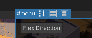
If the selected element has child elements, in UI Builder, you can use toggles in the header to toggle flex-related style properties in the Viewport. The image below shows the options available for the #menu element:

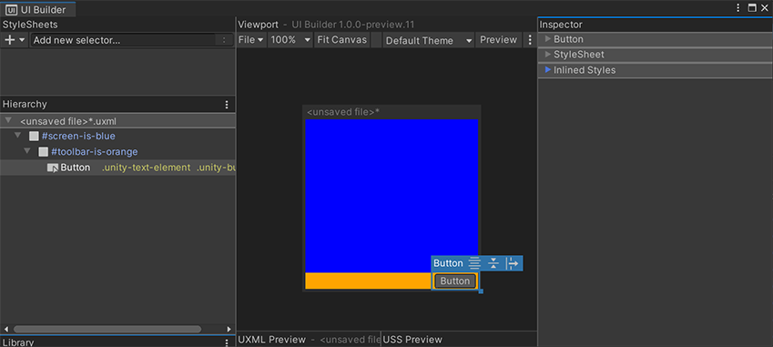
You can use the style properties to create complex, dynamic layouts. Here’s an example of a layout that anchors a Button on the bottom-right edge of the screen:

The UXML for this layout, showing the inline styles set on each container VisualElement, is below:
<ui:UXML xmlns:ui="UnityEngine.UIElements" xmlns:uie="UnityEditor.UIElements">
    <ui:VisualElement name="screen-is-blue" style="flex-grow: 1; justify-content: flex-end; background-color: blue;">
        <ui:VisualElement name="toolbar-is-orange" style="align-items: flex-end; background-color: orange;">
            <ui:Button text="Button" display-tooltip-when-elided="true" />
        </ui:VisualElement>
    </ui:VisualElement>
</ui:UXML>
The containers are colored to reveal their shape. You can use nested VisualElement containers to achieve any dynamic layout without resorting to explicitly setting the position and size of each element. This keeps the layout dynamic and automatically adjusts to the larger container changing size, like the screen changing size.
Absolute position
UI Builder also supports the Position style properties. The Position > Absolute mode makes an element invisible to the default Flexbox-based layout engine. It’s as if it no longer takes any space. Absolute-position elements appear on top of any siblings that are Relative-position.
While using Absolute position, you can use the Position > Left, Top, Right, Bottom style properties to offset and size the element from the respective edges of its parent. This doesn’t set absolute coordinates on the screen but sets offsets relative to the parent element. You can still use Relative mode to position the parent element. If you set both a Left offset and a Right offset, the Width style property of the element is ignored and the computed width will now come from the following formula:
element-computed-width = parent-width - left-offset - right-offset
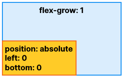
Left, Top, Right, Bottom can also be interpreted as anchors. For example, you can anchor a Button on the bottom-left of the screen:

The UXML below displays the inline styles:
<ui:UXML xmlns:ui="UnityEngine.UIElements" xmlns:uie="UnityEditor.UIElements" editor-extension-mode="False">
    <ui:VisualElement style="flex-grow: 1;">
        <ui:VisualElement style="position: absolute; left: 0; bottom: 0;" />
    </ui:VisualElement>
</ui:UXML>
With positioning, there is a difference between having Left set to 0 and having Left unset:
-
Left set to 0means set an offset of 0. -
Left unsetdoesn’t set any offset and lets other style properties define the width or height of the element.
You can also modify these offset style properties directly in the Canvas via additional resize handles on each edge and corner of the element’s blue selection border. It’s important to differentiate between what’s set and what’s unset, so the Canvas also includes “anchor” toggles as orange squares off each side of the element. The Canvas handles will adjust which style properties are set when resizing the element visually, depending on which “anchors” are set. For example, say you are resizing the element in the Canvas via its right-border handle:
- If you set both Left and Right properties, the handle will update the Right property.
- If you set Left but not Right, the handle will update the Width property.
Use both Relative and Absolute
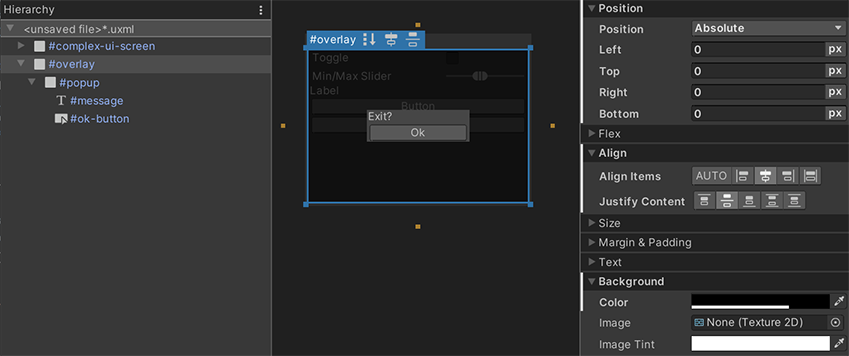
It’s typically discouraged to use Absolute position mode because it bypasses the built-in layout engine in UI Toolkit. It might also lead to high-maintenance UI where changing the overall layout would require manually updating individual elements. However, one of the legitimate use cases for Absolute position mode is for overlays. It’s useful to overlay some complex UI on top of other complex UI, such as a popup or a dropdown. You can use Absolute position only for the overlay container itself while continuing to use Relative mode inside the overlay. Here’s an example of a simple centered popup:
 And here’s the UXML for your reference:
<ui:UXML xmlns:ui="UnityEngine.UIElements" xmlns:uie="UnityEditor.UIElements">
    <ui:VisualElement name="complex-ui-screen">
        <ui:Toggle label="Toggle" />
        <ui:MinMaxSlider picking-mode="Ignore" label="Min/Max Slider" min-value="10" max-value="12" low-limit="-10" high-limit="40" />
        <ui:Label text="Label" />
        <ui:Button text="Button" />
        <ui:Button text="Button" />
    </ui:VisualElement>
    <ui:VisualElement name="overlay" style="position: absolute; left: 0; top: 0; right: 0; bottom: 0; background-color: rgba(0, 0, 0, 0.71); align-items: center; justify-content: center;">
        <ui:VisualElement name="popup" style="background-color: rgba(70, 70, 70, 255);">
            <ui:Label text="Exit?" name="message" />
            <ui:Button text="Ok" name="ok-button" style="width: 108.3333px;" />
        </ui:VisualElement>
    </ui:VisualElement>
</ui:UXML>
The example above highlights the use of Absolute position. Set all Position > Left, Top, Right, Bottom to 0, so the position is 0 pixels away from the edges of the screen. This makes the #overlay element overlap the #complex-ui-screen container element. You can also set a semi-transparent background to the #overlay element to make the other UI appear darkened. Use #overlay to set Relative position to center our #popup container VisualElement.
ベストプラクティス
以下のリストは、レイアウトエンジンのパフォーマンスを向上させるためのコツです。
要素のサイズを定義するには、
widthとheightを設定します。Use the
flexGrowproperty (USS:flex-grow: <value>;) to assign a flexible size to an element. The value of theflexGrowproperty assigns a base weight to the size of an element when it’s determined by its siblings.Set the
flexDirectionproperty torow(USS:flex-direction: row;) to switch to a horizontal layout.元のレイアウト位置に基づいて要素をオフセットするには、相対位置を使用します。
要素を親位置の矩形に対して相対的に配置するには、
positionプロパティをabsoluteに設定します。この場合、兄弟や親のレイアウトには影響しません。