Position element with the layout engine
UI Toolkit includes a layout engine that positions elements based on layout and styling properties. The layout engine uses the layout principles of Yoga, which implements a subset of Flexbox, a HTML/CSS layout system. UI Toolkit properties match Yoga layout behavior. UI Toolkit supports most properties in Flexbox.
By default, all elements are part of the layout. The layout has the following default behaviours:
- 컨테이너가 자식을 수직으로 배포합니다.
- 컨테이너 직사각형의 포지션이 자식 직사각형을 포함합니다. 이 동작은 다른 레이아웃 프로퍼티에 의해 제한될 수 있습니다.
- A
VisualElementwith text uses the text size in its size calculations. This behavior can be limited by other layout properties.
UI Toolkit includes built-in controls for standard UI components, such as a button, toggle, or text field. These built-in controls have styles that affect their layout.
Main style properties
The following are the main style properties:
-
Flex > Direction (
flex-directionin USS): Defines the layout direction the main-axis. The default iscolumnand that makes the main-axis run from top to bottom. -
Flex > Grow (
flex-growin USS): Defines how an element should grow in the main-axis. It’s a ratio that’s shared with all other siblings of the same parent. This property is useful when trying make an element stretch to take up the entire size of its parents (minus any siblings). To do this, set the Flex > Grow value to1. If you have two siblings withflex-growset to1, they will each take 50% of the parent’s available size along the main-axis. -
Align > Align Items (
align-itemsin USS): Defines the alignment of elements in the cross-axis, or the perpendicular axis to the main-axis. For example, if you have two Buttons in aVisualElementthat hasflex-direction: columnandalign-items: flex-endset, the two Buttons will squish against the container’s right edge. The options foralign-itemshave names likeflex-startandflex-endbecause they depend on the value offlex-direction. -
Align > Justify Content (
justify-contentin USS): Defines the alignment of elements in the main-axis. For example, if you have two Buttons in aVisualElementthat hasflex-direction: columnandjustify-content: flex-endset, the two Buttons squish against the container’s bottom edge. The options forjustify-contentare named likeflex-startandflex-endbecause they depend on the value offlex-direction.
For more information, refer to Flex layout.
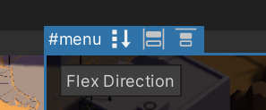
If the selected element has child elements, in UI Builder, you can use toggles in the header to toggle flex-related style properties in the Viewport. The image below shows the options available for the #menu element:
You can use the style properties to create complex, dynamic layouts. Here’s an example of a layout that anchors a Button on the bottom-right edge of the screen:
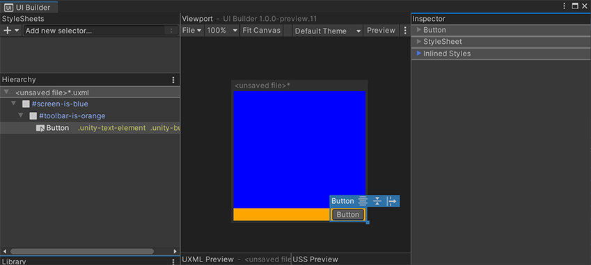
아래는 각 컨테이너 VisualElement에 설정된 인라인 스타일을 나타내는 이 레이아웃의 UXML입니다.
<ui:UXML xmlns:ui="UnityEngine.UIElements" xmlns:uie="UnityEditor.UIElements">
    <ui:VisualElement name="screen-is-blue" style="flex-grow: 1; justify-content: flex-end; background-color: blue;">
        <ui:VisualElement name="toolbar-is-orange" style="align-items: flex-end; background-color: orange;">
            <ui:Button text="Button" display-tooltip-when-elided="true" />
        </ui:VisualElement>
    </ui:VisualElement>
</ui:UXML>
컨테이너는 모양을 드러내기 위해 색칠되어 있습니다. 중첩된 VisualElement 컨테이너를 사용하면 각 요소의 포지션과 크기를 명시적으로 설정하지 않고도 모든 동적 레이아웃을 구현할 수 있습니다. 그러면 레이아웃이 동적으로 유지되며, 크기가 변화하는 더 큰 컨테이너(예: 크기가 변화하는 화면)에 맞춰 자동 조정됩니다.
Absolute 포지션
UI Builder also supports the Position style properties. The Position > Absolute mode makes an element invisible to the default Flexbox-based layout engine. It’s as if it no longer takes any space. Absolute-position elements appear on top of any siblings that are Relative-position.
While using Absolute position, you can use the Position > Left, Top, Right, Bottom style properties to offset and size the element from the respective edges of its parent. This doesn’t set absolute coordinates on the screen but sets offsets relative to the parent element. You can still use Relative mode to position the parent element. If you set both a Left offset and a Right offset, the Width style property of the element is ignored and the computed width will now come from the following formula:
element-computed-width = parent-width - left-offset - right-offset
Left, Top, Right, Bottom can also be interpreted as anchors. For example, you can anchor a Button on the bottom-left of the screen:
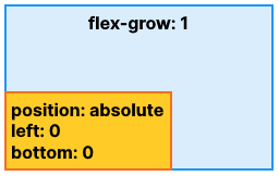
아래 UXML은 인라인 스타일을 나타냅니다.
<ui:UXML xmlns:ui="UnityEngine.UIElements" xmlns:uie="UnityEditor.UIElements" editor-extension-mode="False">
    <ui:VisualElement style="flex-grow: 1;">
        <ui:VisualElement style="position: absolute; left: 0; bottom: 0;" />
    </ui:VisualElement>
</ui:UXML>
위치 지정 시 Left를 0으로 설정하는 것과 Left를 설정하지 않는 것은 다릅니다.
-
Left를 0으로 설정했다는 것은 오프셋을 0으로 설정한다는 의미입니다. -
Left unset은 오프셋을 설정하지 않으며, 다른 스타일 프로퍼티가 요소의 너비나 높이를 정의하도록 둡니다.
요소의 파란색 선택 테두리의 각 가장자리와 코너에 있는 추가적인 크기 조절 핸들을 통해 Canvas에서 직접 이러한 오프셋 스타일 프로퍼티를 수정할 수도 있습니다. 설정된 항목과 설정되지 않은 항목을 구분하는 것이 매우 중요하므로, Canvas는 요소의 각 면에 주황색 정사각형으로 “앵커” 토글을 포함합니다. Canvas 핸들은 요소의 크기를 시각적으로 조절할 때 설정되는 스타일 프로퍼티를 설정된 “앵커”에 따라 조정합니다. 예를 들어, Canvas에서 요소의 크기를 오른쪽 테두리 핸들을 통해 조절하는 경우:
- Left 및 Right 프로퍼티를 모두 설정하면 핸들이 Right 프로퍼티를 업데이트합니다.
- Left 프로퍼티를 설정하고 Right 프로퍼티는 설정하지 않으면 핸들이 Width 프로퍼티를 업데이트합니다.
Use both Relative and Absolute
It’s typically discouraged to use Absolute position mode because it bypasses the built-in layout engine in UI Toolkit. It might also lead to high-maintenance UI where changing the overall layout would require manually updating individual elements. However, one of the legitimate use cases for Absolute position mode is for overlays. It’s useful to overlay some complex UI on top of other complex UI, such as a popup or a dropdown. You can use Absolute position only for the overlay container itself while continuing to use Relative mode inside the overlay. Here’s an example of a simple centered popup:
 다음은 참조용 UXML입니다.
<ui:UXML xmlns:ui="UnityEngine.UIElements" xmlns:uie="UnityEditor.UIElements">
    <ui:VisualElement name="complex-ui-screen">
        <ui:Toggle label="Toggle" />
        <ui:MinMaxSlider picking-mode="Ignore" label="Min/Max Slider" min-value="10" max-value="12" low-limit="-10" high-limit="40" />
        <ui:Label text="Label" />
        <ui:Button text="Button" />
        <ui:Button text="Button" />
    </ui:VisualElement>
    <ui:VisualElement name="overlay" style="position: absolute; left: 0; top: 0; right: 0; bottom: 0; background-color: rgba(0, 0, 0, 0.71); align-items: center; justify-content: center;">
        <ui:VisualElement name="popup" style="background-color: rgba(70, 70, 70, 255);">
            <ui:Label text="Exit?" name="message" />
            <ui:Button text="Ok" name="ok-button" style="width: 108.3333px;" />
        </ui:VisualElement>
    </ui:VisualElement>
</ui:UXML>
위의 예제는 Absolute 포지션의 사용을 강조 표시합니다. 모든 Position > Left, Top, Right, Bottom을 0으로 설정하여 포지션을 화면 가장자리에서 0 픽셀만큼 떨어지도록 하면 #overlay 요소가 #complex-ui-screen 컨테이너 요소와 겹칩니다. #overlay 요소에 반투명 배경을 설정하여 다른 UI를 더 어둡게 보이도록 할 수도 있습니다. #popup 컨테이너 VisualElement가 중앙에 위치하도록 Relative 포지션을 설정하려면 #overlay를 사용하십시오.
베스트 프랙티스
다음 리스트는 레이아웃 엔진의 성능을 향상하는 데 도움이 되는 팁을 제공합니다.
width와height를 설정하여 요소의 크기를 정의하십시오.Use the
flexGrowproperty (USS:flex-grow: <value>;) to assign a flexible size to an element. The value of theflexGrowproperty assigns a base weight to the size of an element when it’s determined by its siblings.Set the
flexDirectionproperty torow(USS:flex-direction: row;) to switch to a horizontal layout.상대 위치 지정을 사용하여 원본 레이아웃 포지션을 기준으로 요소를 오프셋하십시오.
position프로퍼티를absolute로 설정하여 부모 포지션 직사각형을 기준으로 요소를 배치하십시오. 형제 또는 부모의 레이아웃에는 영향을 주지 않습니다.
추가 리소스
Copyright © 2023 Unity Technologies
优美缔软件(上海)有限公司 版权所有
"Unity"、Unity 徽标及其他 Unity 商标是 Unity Technologies 或其附属机构在美国及其他地区的商标或注册商标。其他名称或品牌是其各自所有者的商标。
公安部备案号:
31010902002961