Splash Screen
The Unity Editor allows you to configure a Splash Screen for your project. The level to which you can customize the Unity Splash Screen depends on your Unity license; depending on which licence you have, you can disable the Unity Splash Screen entirely, disable the Unity logo, and add your own logos, among other options.
You can also make your own introductory screens or animations to introduce your project in your first Scene, using the the Unity UI System. These can be in addition to or instead of using the Unity Splash Screen, depending on your license.
The Unity Splash Screen is uniform across all platforms. It displays promptly, displaying while the first Scene loads asynchronously in the background. This is different to your own introductory screens or animations which can take time to appear; this is due to Unity having to load the entire engine and first Scene before displaying them.
License limitations
The Unity Pro Edition and Plus Editions licenses have no limitations to customisation of the Unity Splash Screen.
The Unity Personal Edition license has the following limitations:
- The Unity Splash Screen cannot be disabled.
- The Unity logo cannot be disabled.
- The opacity level can be set to a minimum value of 0.5.
Unity Splash Screen settings
To access the Unity Splash Screen settings, go to Edit > Project Settings > Player. In the Inspector window, navigate to Splash Image > Splash Screen.
| Property | Function |
|---|---|
| Show Splash Screen | Tick the Show Splash Screen checkbox to enable the Splash Screen at the start of the game. In the Unity Personal Edition you cannot disable this option; the checkbox is always ticked. |
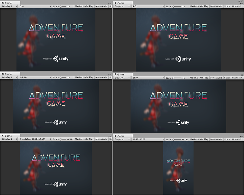
| Preview | Use the Preview button to see a preview of the Splash Screen in the Game view. The preview reflects the resolution and aspect ratio of the Game view. Use multiple Game views to preview multiple different resolutions and aspect ratios simultaneously. This is particularly useful for simulating the Splash Screen’s appearance on multiple different devices. See Image A, below, for an example. |
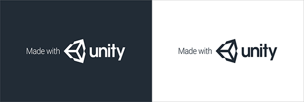
| Splash Style | Splash Style controls the style of the Unity branding. There are two options available: Light on Dark, or Dark on White. See these in Image B, below. |
| Animation | The Splash Screen has 3 possible animation modes, which define how it appears and disappears from the screen. |
| Static | The Splash Screen has no animation. |
| Dolly | The logo and background zoom to create a visual dolly effect. |
| Custom | Configure the background and logo zoom amounts to allow for a modified dolly effect. |
| Show Unity logo | Tick the Show Unity Logo checkbox to enable Unity co-branding. In the Unity Personal Edition you cannot disable this option; the checkbox is always ticked. |
| Draw Mode | Draw Mode controls how Unity co-branding is shown (if Unity co-branding is enabled). |
| Unity Logo Below | Draws the co-branding Unity logo beneath all logos that are shown. |
| All Sequential | Inserts the co-branding Unity logo as a logo into the Logos list. |
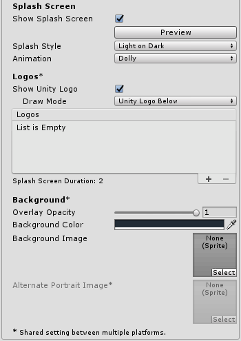
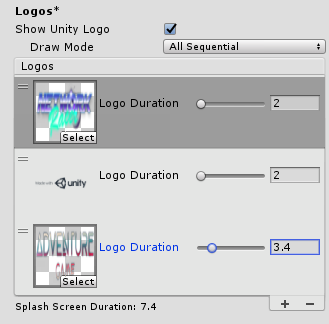
| Logos | This is the customisable list of logos to be drawn during the duration of the Splash Screen. See the Logo list in Image C, below. Add and remove logos using the plus (+) and minus (-) buttons, and reorder logos in the list by dragging and dropping. Each logo must be a Sprite Asset. To change the aspect ratio of the logo, change the dimensions of the Sprite using the Sprite Editor, with Sprite Mode set to Multiple. The Logo Duration of the Sprite Asset is the length of time the logo appears for. This can be set to between a minimum of 2 seconds and a maximum of 10 seconds. If an entry in the Logos list has no logo Sprite Asset assigned, no logo is shown for the duration of that entry. You can use this to create delays between logos. The entire duration of the Splash Screen is the total of all logos plus 0.5 seconds for fading out. This might be longer if the first Scene is not ready to play, in which case the Splash Screen shows only the background image or color and then fades out when the first Scene is ready to play. |
| Overlay Opacity | Adjust the strength of the Overlay Opacity to make the logos stand out; this affects the background color and/or image color, based on the Splash Style. Set Overlay Opacity to a lower number to reduce this effect, or set it to 0 to disable the effect completely. For example, if the Splash Screen style is Light on Dark, with a white background, the background becomes gray when Overlay Opacity is set to 1, and white when Overlay Opacity is set to 0. In the Unity Personal Edition, this option has a minimum value of 0.5. |
| Background Color | Use this to set the background color when no background image is set. Note that the actual background color may be affected by the Overlay Opacity (see section above), and might not match the assigned color. |
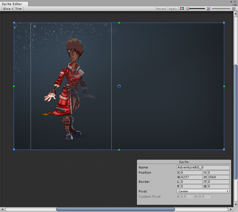
| Background Image | Use this to set a background Sprite image instead of using a color background. Unity adjusts the background image so that it fills the screen; the image is uniformly scaled until it fits both the width and height of the screen. This means that parts of the image might extend beyond the screen edges in some aspect ratios. To adjust the background image’s response to aspect ratio, change the Sprite’s Position values in the Sprite Editor. Use Alternate Portrait Image to set an image with portrait aspect ratios (for example, a mobile device in portrait mode). If there is no Alternate Portrait Image Sprite assigned, the Unity Editor uses the Sprite assigned as the Background Image for both portrait and landscape mode. Adjust the Position and dimensions of the Sprite in the Sprite Editor to control the aspect ratio and position of the background image on the Splash Screen. In Image D, below, the same image is being used for both landscape and portrait; however, the portrait position has been adjusted. |
对文档有任何疑问,请移步至开发者社区提问,我们将尽快为您解答