Introduction to visual elements and the visual tree
The most basic building block in UI Toolkit is a visual elementA node of a visual tree that instantiates or derives from the C# VisualElement class. You can style the look, define the behaviour, and display it on screen as part of the UI. More info
See in Glossary. The visual elements are ordered into a hierarchy tree with parent-child relationships. This is called the visual treeAn object graph, made of lightweight nodes, that holds all the elements in a window or panel. It defines every UI you build with the UI Toolkit.
See in Glossary.
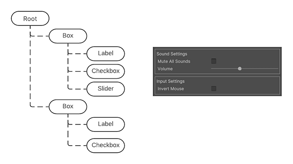
The diagram below displays a simplified example of the visual tree, and the rendered result in UI Toolkit.

The Root in the diagram represents the EditorWindow.rootVisualElement in the Editor UI and the UIDocument.rootVisualElement in a runtime UI.
The VisualElement class is the base for all nodes in the visual tree. The VisualElement base class contains properties such as styles, layout data, and event handlers. Visual elements can have children and descendant visual elements. For example, in the diagram above, the first Box visual element has three child visual elements: Label, Checkbox, and Slider.
You can customize the appearance of visual elements through inline styles and stylesheets. You can also use event callbacks to modify the behavior of a visual element.
VisualElement derives into subclasses that define additional behavior and functionality, such as controls. UI Toolkit includes a variety of built-in controls with specialized behavior. A control is an element of a graphical user interface. For example, the following items are available as built-in controls:
A control includes the visual of the control, and the scripted logic to operate and interact with the control. It can consist of a single visual element, or a combination of multiple visual elements. For example, the Toggle control contains three elements:
- 文本标签
- 一个框图像
- 一个复选标记的图像

The implementation of the Toggle control defines the behavior of the control. It has an internal value of whether the toggle state is true or false. This logic alternates the visibility of the checkmark image when the value changes.
You can also combine visual elements together and modify their behavior to create custom controls.
To use a control in a UI, add it to the visual tree.